Looks fantastic Gary, really good work. When you get you hands on CourseForge I'm sure you will be able to do some magic with it.

Measurements in Unity
#41

Posted 05 March 2014 - 08:07 AM
- garynorman likes this
#43

Posted 05 March 2014 - 10:26 AM
Yeah love the images and the planting Gary... great looking hole.
#44

Posted 05 March 2014 - 10:59 AM
I think that I've finally had a breakthrough with the grass (which is the hardest thing to get looking good imo)
I'm still waiting for that one on my end. Please share.
>>>>>>> Ka-Boom!
• Mulligan Municipal • Willow Heath • Pommeroy • Karen • Five Sisters • Xaxnax Borealis • Aroha • Prison Puttˆ
• The Upchuck • The Shogun • Black Swan (•)
<<<<<
#45

Posted 05 March 2014 - 12:42 PM
I'm still waiting for that one on my end. Please share.
It's a bit trial and error, but the key is (well at least for me anyway) to desaturate and colour balance the grass in Photoshop, then fine tune with the dry and healthy colours in Unity.
#46

Posted 05 March 2014 - 01:39 PM
m'okay… been there. Many times. But thanks.
I don't have issues with the color coordination or the color matching with the course. It's just that my grass, from certain angles, looks either totally fake or like a zombie reincarnation of Links with cheap grass cutouts plastered over a terrain. Weirdly enough, that's just me on my course - yours looks fine, gary. Perhaps I'm seeing things that aren't even there...
This may have to do with the detail map resolution of my terrain - it's still 1024 and maybe I need to up it to 2048. But I'm a bit concerned that if I increase the density of my grass bushes, then the effect of the draw stop at 250 meters distance will get a lot worse. Ah well...
>>>>>>> Ka-Boom!
• Mulligan Municipal • Willow Heath • Pommeroy • Karen • Five Sisters • Xaxnax Borealis • Aroha • Prison Puttˆ
• The Upchuck • The Shogun • Black Swan (•)
<<<<<
#47

Posted 05 March 2014 - 03:06 PM
A word of caution if you change the terrain resolution in Unity. Save your project as a different one, a copy in effect, then try changing the resolution. You might run into some problems.
Win 10 64bit
#48

Posted 06 March 2014 - 04:53 AM
Weirdly enough, that's just me on my course - yours looks fine, gary. Perhaps I'm seeing things that aren't even there...
One thing I've noticed is the scaling down of screen shots for the forum here makes courses look better, it just gives them that blur so they don't look so crisp and unantialiased. Even gary's pic above, look at the difference between how the forum shows it and when it's clicked. (btw gary, I see that bilinear blurring on your terrain textures, change to trilinear to fix up just in case you weren't aware).
- garynorman likes this
#49

Posted 07 March 2014 - 11:47 AM
Thanks for the tip on the trilinear textures, Shimonko ![]()
After spending a good couple of hours trying to figure out Unity water (with no success!) and how to raise the entire terrain (with success!), it's back to the course...
Here's the approach to the par4, 9th:

- JoeF, Kablammo11, highfade and 3 others like this
#50

Posted 07 March 2014 - 06:42 PM
Stunning work Gary, especially when considering you did it all from scratch w/out CF as a guideline.
- garynorman and highfade like this
#51

Posted 07 March 2014 - 08:51 PM
Thanks Keith ![]()
I think that the key thing without having CF is getting an idea of the scale of things... Once that is done, I would imagine that the workflow is similar to what it is with CF, except of course the extra control that CF will give you with the actual shapes that make up the course.
...and bunkers!! I really miss being able to create decent bunkers!!
Who knows though, when I get CF I may find that all of the yardages are completely out and have to start again!! Still, it's good practice ![]()
#52

Posted 07 March 2014 - 09:42 PM
This is the view from the tee at the par 3, 7th. I'm not sure yet whether I will stick with the 'dirt bumps' as I'm not sure that they sit well on a links course, but hey...
PS, do let me know if you are getting bored with all the pics...

- JoeF, Davefevs, Keith and 1 other like this
#53

Posted 07 March 2014 - 10:21 PM
Nice... more is less as they say when speaking into mirrors... so keep them coming!
Think it's one hell of a Par 3 though lol... what distance do you estimate that to be..?
#54

Posted 07 March 2014 - 10:26 PM
I'm hoping it's about 180yds... (hoping)
I think the camera perspective may lengthen it a bit.
#55

Posted 08 March 2014 - 11:32 AM
The viewer camera is at a considerable wide angle - you can see it distorting objects near to you - and everything will seem to be further away than it is.
I really like the fog effect on your course, gary. It adds a lot of atmosphere. So does the low light source, bringing the terrain alive with the shadows. And the evening sky skybox to match… if all works together so nicely. You, Sir, are a man of good tastes and I salute you.
- garynorman likes this
>>>>>>> Ka-Boom!
• Mulligan Municipal • Willow Heath • Pommeroy • Karen • Five Sisters • Xaxnax Borealis • Aroha • Prison Puttˆ
• The Upchuck • The Shogun • Black Swan (•)
<<<<<
#56

Posted 08 March 2014 - 03:03 PM
You're right, the fog offers atmosphere.... nice touch, missed that first time.
See K11... you need fog... foggy willows...mmmmmm a course name jumps right out..
#57

Posted 08 March 2014 - 03:47 PM
*sigh….
(he won't let it go, so I might as well go along with it)
Fine, whatever! After all, why...
(Stop! Smile. Better than that. Always polite… smile more… good, now go…)
Splendid idea, Ian! I can see how this would vastly improve the atmospheric mood of the Heath…
(yeah, right!)
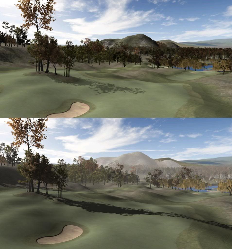
So I went and made THIS:

The top image is the K11 usual, directional light shining in from a 45 degree angle at 0.7 strengthe, with soft shadows reduced to 0.48 percent opacity.
Below is a garynormanization - or rather an homage to garynorman: Directional light low at 25 degree and 0.85, shadows at around 0.75 opacity and 0.007 whitish fog. Note that fog apparently does not affect the panorama (right half of background, behind Mount Tara.
Well, we've all learned something from this.
(No bleeping idea what that might be, but this topic is done for now! Quick, add a smiley or two to show you didn't mean it. Yeah you did, but do it anyway…)
![]()
![]()
![]()
Sorry for barging into your thread with this, gary.
(Ian made me do it!)
- JoeF, garynorman, Keith and 2 others like this
>>>>>>> Ka-Boom!
• Mulligan Municipal • Willow Heath • Pommeroy • Karen • Five Sisters • Xaxnax Borealis • Aroha • Prison Puttˆ
• The Upchuck • The Shogun • Black Swan (•)
<<<<<
#58

Posted 08 March 2014 - 04:37 PM
Looks good to me, and feel free to barge in anytime ![]()
Interesting that the fog does not affect the pano...
#59

Posted 08 March 2014 - 04:50 PM
Yeah… I've got the landscape part of the pano on transparent PSD layers, so I will probably need to import these as scenery cutouts in front of a clear sky...
>>>>>>> Ka-Boom!
• Mulligan Municipal • Willow Heath • Pommeroy • Karen • Five Sisters • Xaxnax Borealis • Aroha • Prison Puttˆ
• The Upchuck • The Shogun • Black Swan (•)
<<<<<
#60

Posted 08 March 2014 - 06:41 PM
I've just uploaded a video to youtube (no sound) showing my process for the rough design of a hole in Unity. I have sped the process up on the video, but it took ten minutes from start to finish.
I'm not sure if it will be of any use to people but I know that if I were designing, I would find it interesting to see how others worked, so that's why I uploaded it.
Cheers,
Gary
- Unique, Kablammo11, highfade and 2 others like this
4 user(s) are reading this topic
0 members, 4 guests, 0 anonymous users


