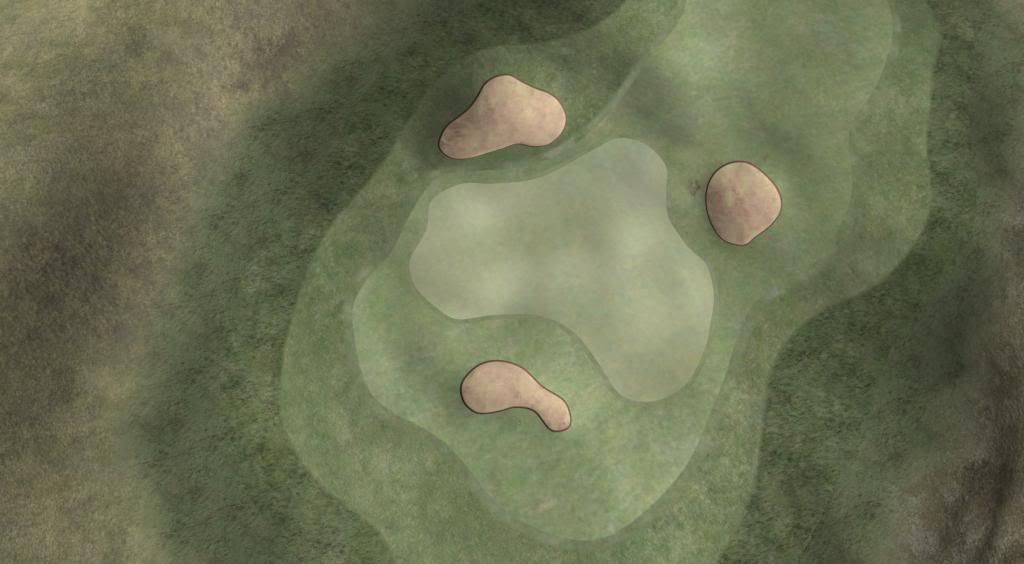
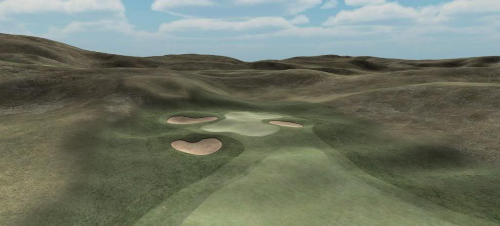
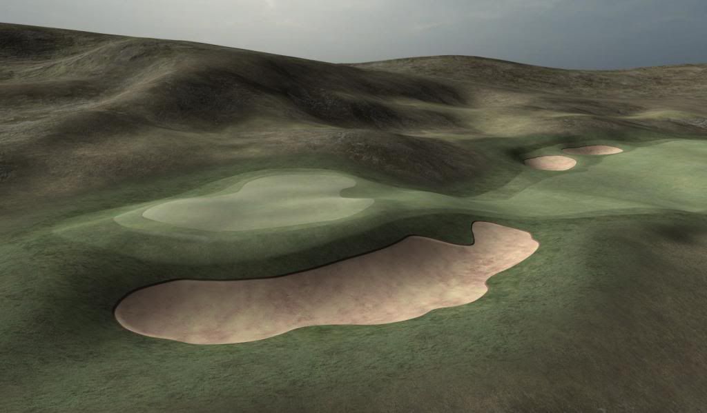
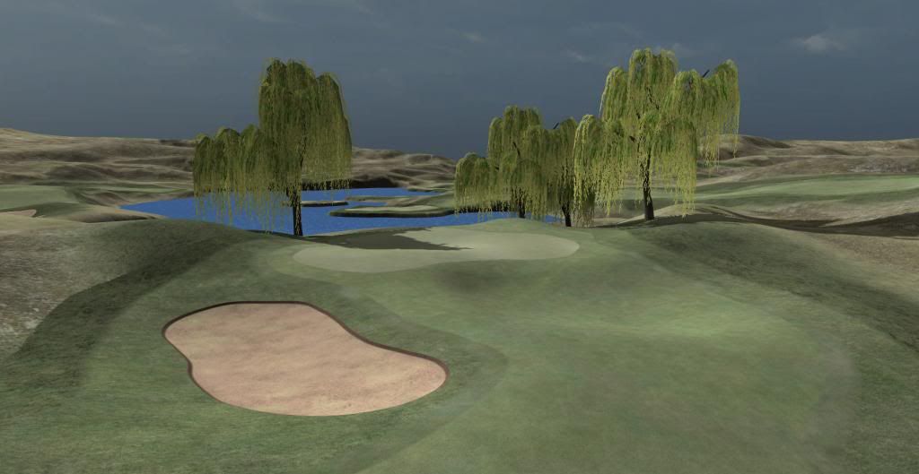
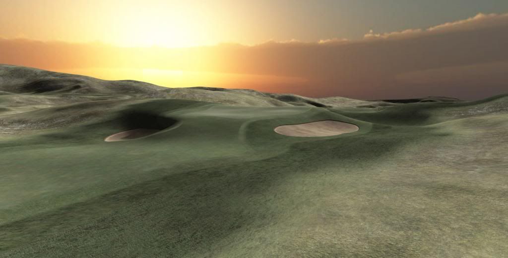
Yeah..looking good. Layout has really sprung to life. K11 did you ever design via Links or TW, or is this your 1st effort overall?

Show & Tell
#41

Posted 15 February 2014 - 03:08 PM
#42

Posted 15 February 2014 - 03:13 PM
K11, I have the same problem. I think once we get our hands on some decent bushes and grasses you can create your grassland look which I think will suite your course better ![]()
Intel Core i5-6600 CPU 3.3 GHz Geforce GTX 1060 16GB RAM Windows 10 64 bit
Hazyview (600m above sea level) -- Nautilus Bay (Revamp done) -- Cape Fear (TGC adaptation) -- Aloe Ridge -- Nahoon Reef GC -- Chambers Bay
Abel's Crossing -- Solitude Links GC
#43

Posted 15 February 2014 - 03:31 PM
#44

Posted 15 February 2014 - 03:35 PM
Keith, I did some designs many years ago with APCD and, before that, with JN5 for Mac. Never published anything, just for myself.
Thanks highfade. I probably need to look into grass stuff now, just to check how that works out and what to look out for in general, before I can settle on a final look and grass-forest-percentage. So much to do...
Everybody, highfade has posted a couple of tee-box pics you might want to check out here (click me)
>>>>>>> Ka-Boom!
• Mulligan Municipal • Willow Heath • Pommeroy • Karen • Five Sisters • Xaxnax Borealis • Aroha • Prison Puttˆ
• The Upchuck • The Shogun • Black Swan (•)
<<<<<
#45

Posted 15 February 2014 - 04:42 PM
This course looks really great. How do panoramas work? And could you post some pictures from the ground perspective as if we were playing the game?
Sensible request mhammer113 - you just wrote it while I was posting my previous comment.
About panoramas, they are a different story - More a Photoshop than a CF or Unity story, actually. I'm sure CF will ship with a few panoramas. Quickest answer - if you know what a Skybox is or does (and you should, if you consider having a go at course designs), my panorma is a doctored Skybox, where I have added a landscape layer over the cloud pictures.
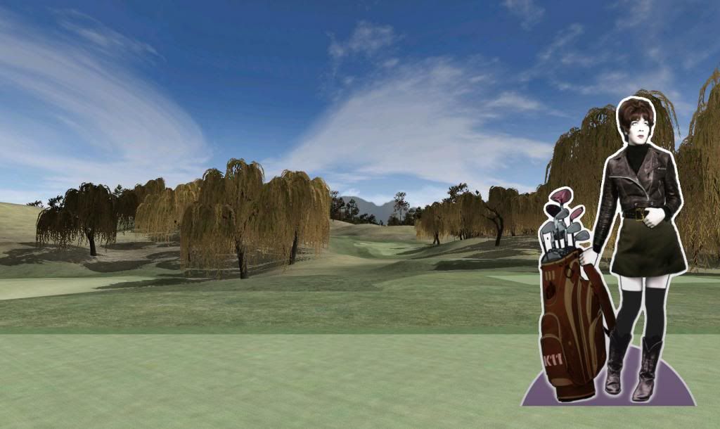
And with that, to the main event. Dammit, Tara hates it when I ask her to work on a Saturday, but she's a good sport and was willing to pose for my latest series of player POV shots. For your kind consideration and potential delectation, find below...
The view from the 1st tee, a 375 uphill par 4. The green at the left edge is the 9th:
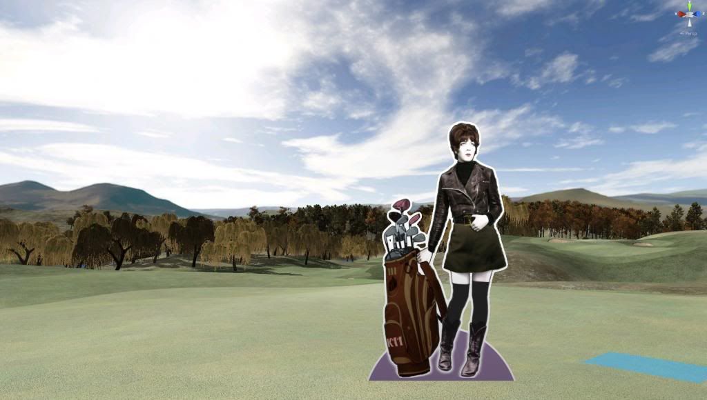
And this is the view looking back, standing on the 1st green. 2nd green (190 yds par 3) in the background right
And onto the 4th tee (par 5, 540yds) your uphill/upwind drive needs to reach the top at 255+yds...
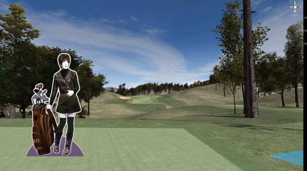
…for you to overlook your 2nd shot...
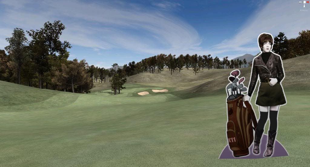
…to a shallow green. Right now, it's still a bit too mean, sloping away from the fairway in the back left. All greens, however, will be revisited and made a bit more level. To do this properly, however, I would need to play-test the design.
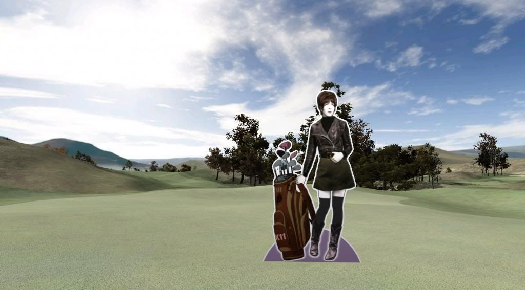
Ah, and that would be the 11th tee (par 4, 472yds). It shares...
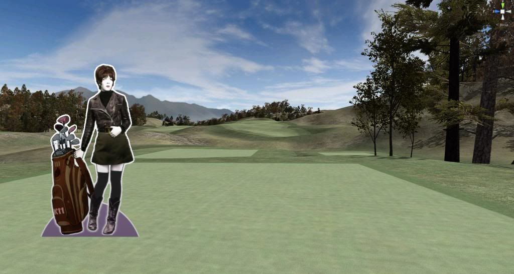
…a fairway with the 14th (par 5, 530yds), coming back towards the clubhouse.
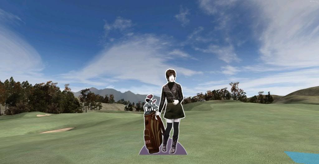
the 11th green, top tier. Bad place to set up a downhill putt, at least the panorama is grand
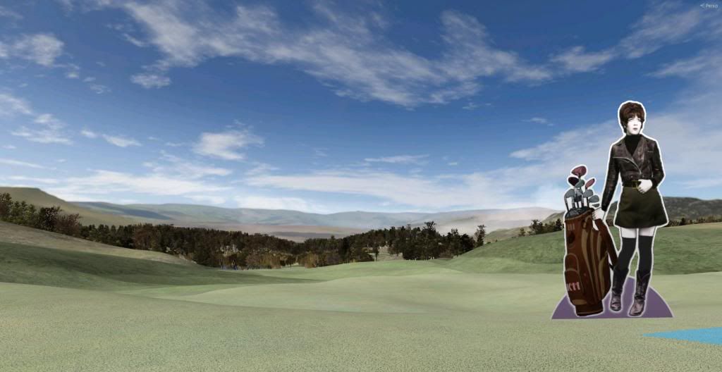
The 12th tee (all the tees shown are back tees) - 482 yds
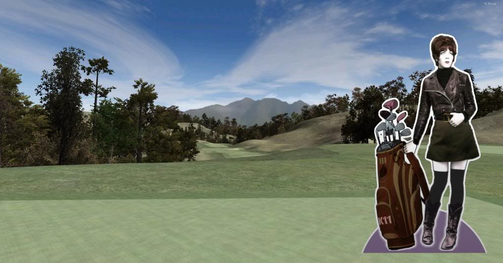
(have to continue in the next post - image limit)
>>>>>>> Ka-Boom!
• Mulligan Municipal • Willow Heath • Pommeroy • Karen • Five Sisters • Xaxnax Borealis • Aroha • Prison Puttˆ
• The Upchuck • The Shogun • Black Swan (•)
<<<<<
#46

Posted 15 February 2014 - 04:43 PM
The 14th (shared fw with 11) Nice, comfy downslope to hit with your driver - but there's an invisible bunker down there (find it on picture of 11th fairway)
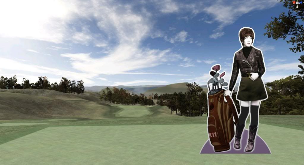
The 14th green. Sunshine. Tara - all good!
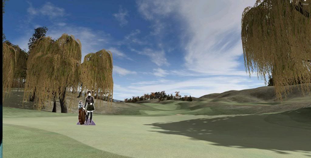
And the 18th tee - once more. Both the tee boxes and the green up ahead will be adorned with bulkheads. Well, actually, with low stone walls. Tara is already working the phones to find a local builder...
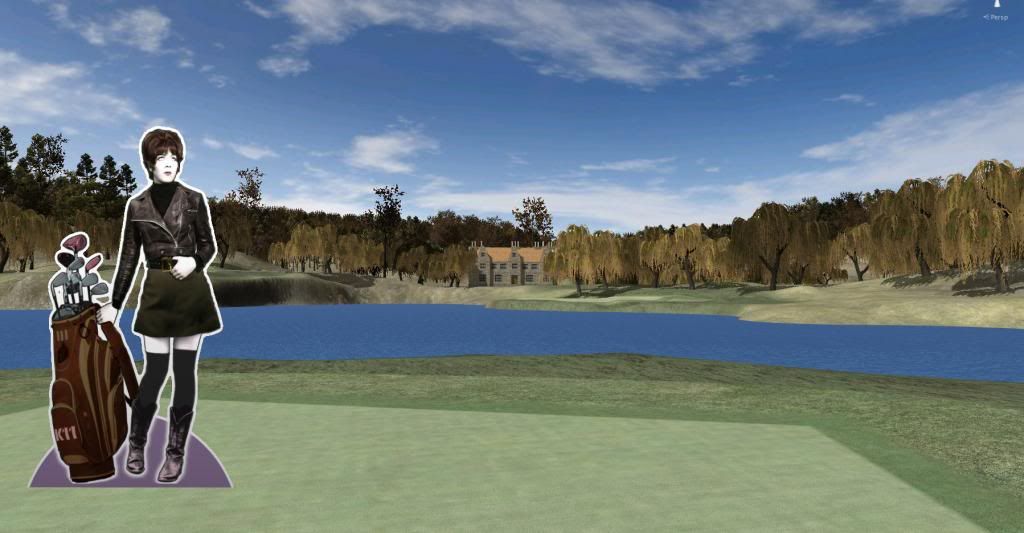
and finally, 138yds across the pond, the 18th green. Course par is 72.
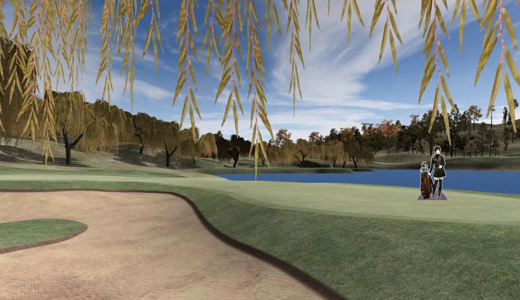
Hope that helped, mhammer, and gives you and idea of the finished setup. It's a work in progress, keep that in mind. Nothing is cast in stone yet. But you do owe Tara a bottle of champagne.
- Davefevs, PMc and nstone73 like this
>>>>>>> Ka-Boom!
• Mulligan Municipal • Willow Heath • Pommeroy • Karen • Five Sisters • Xaxnax Borealis • Aroha • Prison Puttˆ
• The Upchuck • The Shogun • Black Swan (•)
<<<<<
#47

Posted 15 February 2014 - 05:47 PM
Thanks for the shots! Looking good....
#49

Posted 15 February 2014 - 09:34 PM
A few visuals…
Hello everyone, i have only few words, was thinking but at last i have only few words.
Gents, K11 is the Boy !
K11 Man, you froze my breath up at a first sight, this is a great job, outstanding work K11.
Cheers
#50

Posted 15 February 2014 - 10:06 PM
@K11 - To, me the textures you are using look more suited to a dry, links style course. If you're going to keep the trees I think you need to add more colour to the textures.
#51

Posted 16 February 2014 - 09:10 AM
Andy, my exuberant friend: Please don't go all fanboy on me.
Acrilix. Yes, I agree with you. That texture (actually a mix of 2 or 3 overlayed textures) is unsuitable in certain places, especially everywhere underneath the trees. It will be replaced, in time.
That's the thing about Unity/CF course building in general - none of your first features make it to the end unchanged - there is a constant tweaking, adjusting, switching out going on. And once you add a new element, like trees, this reverberates all the way back to terrain elevation (raise or lower it to make the treeline more dramatic), course shapes (bring parts in or out of the tree shadows - move tees to adapt to new possible driving challenges) and, of course, textures.
I still want to go for a "dry" feeling overall, even with all the trees. I might have to make their foliage lighter and more yellow for that. Unity is absolutely brilliant when you need to change or replace previously imported stuff quickly. Color adjustments, tiling value, texture swaps can all be implemented within seconds - so there's no hurry and no need to tend to them right now.
But before I can go about adjusting the textures, there is a new element I need to add to the equation: Grass. I will start planting some of it today, but I can't promise I'll have something to show by the end of my second 2hr session (That's how I roll, short bursts). But once I have my grass, this, too, will interfere with everything else and call it into question yet again, including the textures.
It's a deliciously complicated and very sensitive design ecosystem, one I very much enjoy being overwhelmed by. It's like playing a strategy game.
- IanD likes this
>>>>>>> Ka-Boom!
• Mulligan Municipal • Willow Heath • Pommeroy • Karen • Five Sisters • Xaxnax Borealis • Aroha • Prison Puttˆ
• The Upchuck • The Shogun • Black Swan (•)
<<<<<
#52

Posted 16 February 2014 - 09:40 AM
Can't actually agree more... it's had me up and on here from before dawn... spent most of Saturday on it and whilst I know it's necessary, I begrudge having to go to the shops to get household stuff lol... oh well, sometimes better to walk away and think about things too.
I'm not even at your stage yet... just developing the symptoms of Unitus..
#53

Posted 16 February 2014 - 12:28 PM
Grassy toils and travails, part 1
I began with adding 1 type of grass to grass palette: Heather. I set min/max width and height. Noise Spread increases the irregularity with wich the grass cutout is applied, the healthy and dry colors are a joke anyway, so I set them to white.
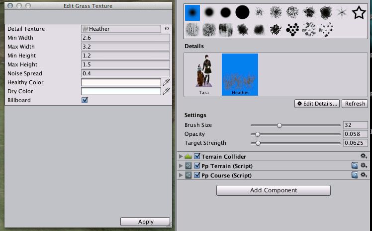
What's important is that you tick the little Billboard box. That will make the grass cutout ALWAYS face the active camera. If you didn't tick that, your grass would remain flat and fake.
Next step: Go out there and paint on the grass. Here's what I got:
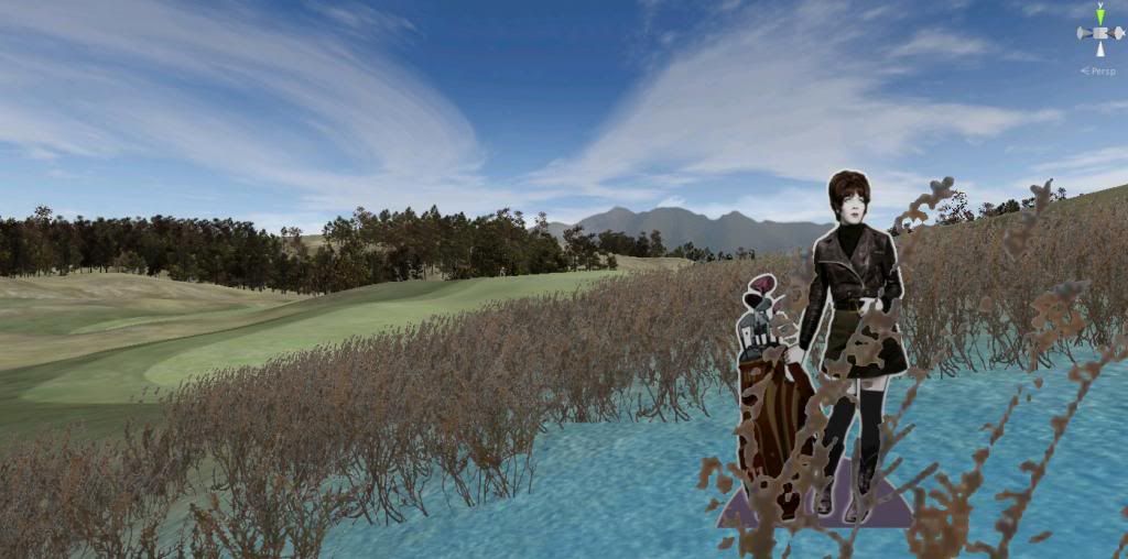
Well, at least it doesn't look dreadful. Also, this screen is taken at "Good" quality settings, with no anti-aliasing active - normally, I post pictures taken at "Fantastic" quality, with all the shadows on etc. Also, the ground texture (I know, Acrilix! ![]() ) does not work together with this grass. Still, my stuff should look good on "good" - and this doesn't. This grass here is a bit monotonous and fake. Even Andy Jumbo would probably thaw up his frozen breath in a microsecond, posting "K11 Man, you're not the Boy, you're a stupid Baby!" And he would be right!
) does not work together with this grass. Still, my stuff should look good on "good" - and this doesn't. This grass here is a bit monotonous and fake. Even Andy Jumbo would probably thaw up his frozen breath in a microsecond, posting "K11 Man, you're not the Boy, you're a stupid Baby!" And he would be right! ![]()
So, I need more variety and better grass (Heather can stay in the mix, but more as an effect-type of punctual grass).
There is something inside me that absolutely refuses to use default textures, btw. Unity offers me 5 grass/flowers/weeds cutouts (and I would strongly expect CF to ship with plenty more of these), but noooo… I have an obsessive urge to go all DYI on this. So my next port of call is Google images. Go search there yourself for "grass + png" or "grass + transparent" or dry, deep, tall, short grass, and you'll find a plethora of useful stuff
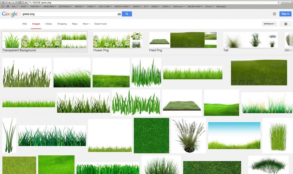
Some of it is watermarked, others want to sell their stuff, but a few decent ones are for free. The next 88 minutes I spent in Photoshop, arranging the grass images, adjusting their colors, working on the edges of some, you know, the usual. I ended up with 14 grass cutouts inside a folder. Here they are:
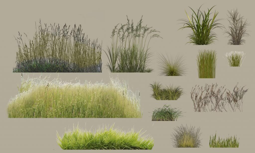
Now the plan for my next session is to find one hole to grass up, start with creating a good, general grass carpet of low grass on the grassy areas, add some taller grass a bit further away and finally increase the variety by adding patches of effect grass. I have no idea what will happen, but I am now prepared to go out there and see what gives. But first, a couple cups of coffee, a cigarette, some soothing music and perhaps a bit of internet porn. See you later.
Oh, all this grassiness is completely free of any CF involvement. It's basically you, the internet, Photoshop and Unity. So everyone of you could, theoretically, start working on this as well, now.
- Davefevs likes this
>>>>>>> Ka-Boom!
• Mulligan Municipal • Willow Heath • Pommeroy • Karen • Five Sisters • Xaxnax Borealis • Aroha • Prison Puttˆ
• The Upchuck • The Shogun • Black Swan (•)
<<<<<
#54

Posted 16 February 2014 - 12:34 PM
lol... good read... aside from the coffee.. I'm a tea man... I think we're related..
#55

Posted 16 February 2014 - 01:39 PM
I know this isn't about me... but I can't help myself now I'm finding new things and discovering more and more..

It's far from anywhere near good enough... but aside from the trees and bushes, everything else is either in Unity or created.
I am not keen on the wind and movement effects on the grass/ferns and weeds just yet and that wouldn't show in the image anyway. A little way to go regarding learning that, but thought I'd throw an image on here to see what you come up with.. honestly I'm not competing either.. you're simply giving me something to go at. What I did like, was the ability to plant the grasses and then adjust the colour whilst watching them all align with my adjustment. It makes it so much easier to see whether you have something near enough to fine tune.
#56

Posted 16 February 2014 - 04:23 PM
Why the heck not, IanD? Because I've got nothing to show. It's a beacon of hope in my bleak world. Nice to have another volunteer stand before the class at this Show & Tell.
My own attempts were an umitigated disaster - I quickly ran into transparency issues, weird white lines showing on top of my pngs. I'm sorry, but why can't the f***tards over at Unity just give a guy a break when he wants to import a bloody perfect transparent alpha file. It's an effin', friggin' f***ing disgrace how complex and stupidly nerdy these overgeeks are about the f***ing simplest of tasks like f***ing importing a tiny f***ing psd with a f***ing transparency? This is f***ing 21st century, ffs!!!!
And now f***ing mipmaps and stuff? And what now? You want 1500 f***ing bucks for a Pro version of this f***ed-up geekfest of a piece of cra... (BIG SLAP!)
Thanks, Mom, needed that. Deep breaths, dude. In… and… out...
Well, class, you just witnessed a classic Unity-induced fit of utterly righteous rage. If you want to share in my pain, see what best describes my current predicament, yet without offering any glimpse of help: https://docs.unity3d.com/Documentation/Manual/Textures.html
You all will experience similar bouts of anger and revulsion in due time. You all will! And, like me, you will drop everything, back off, walk away, and return in the morning with strengthened purpose. This ain't over!
- TheBigYin519, IanD and NoPutt like this
>>>>>>> Ka-Boom!
• Mulligan Municipal • Willow Heath • Pommeroy • Karen • Five Sisters • Xaxnax Borealis • Aroha • Prison Puttˆ
• The Upchuck • The Shogun • Black Swan (•)
<<<<<
#57

Posted 16 February 2014 - 05:05 PM
I did a couple of test with some of my old APCD .tga files and it worked with no problem, even swayed in the wind and some images weren't even square. ![]()
- rmoor13 likes this
Intel Core i5-6600 CPU 3.3 GHz Geforce GTX 1060 16GB RAM Windows 10 64 bit
Hazyview (600m above sea level) -- Nautilus Bay (Revamp done) -- Cape Fear (TGC adaptation) -- Aloe Ridge -- Nahoon Reef GC -- Chambers Bay
Abel's Crossing -- Solitude Links GC
#58

Posted 16 February 2014 - 05:16 PM
Yeah, rub it in, why don't you? Good show, highfade!
- TheBigYin519 likes this
>>>>>>> Ka-Boom!
• Mulligan Municipal • Willow Heath • Pommeroy • Karen • Five Sisters • Xaxnax Borealis • Aroha • Prison Puttˆ
• The Upchuck • The Shogun • Black Swan (•)
<<<<<
#59

Posted 16 February 2014 - 05:52 PM
If you're out there it's not a fade, it's a slice... ![]()
Nice work (on the course) though!
Mobo: Asus Sabertooth P67 CPU: Intel Core i7-2600K CPU Cooler: Corsair Hydro H60 RAM: Corsair Vengeance DDR 3 1600 MHz 8GB GPU: MSI GeForce 970 GTX Gaming 4G Sound: Creative Soundblaster Extreme Gamer SSD: OCZ Agility 3 64GB HDD: 1x 2TB, 1x 1TB, 1x 320 GB Western Digital PSU: Corsair CX 600W Chassi: Thermaltake Aguila
#60

Posted 16 February 2014 - 05:56 PM
A slice is considered to be quite a bit more than how ever much you fade the ball.
- Davefevs likes this
Lakes of Taylor Golf Course
Links at Gateway Golf Club
1 user(s) are reading this topic
0 members, 1 guests, 0 anonymous users


 This topic is locked


