Great work MK1978!

Show & Tell
#541

Posted 30 June 2014 - 08:26 AM
#542

Posted 30 June 2014 - 08:52 AM
My word, what a great labour of love... All this in Unity...boggles the mind, I'd never have the patience...
mk1978, yes, my textures are free of use to those who want. In CourseForge, every playing surface consists of two elements: A base texture providing the coloring and texture (in the other sense of the word) of the ground - and a shader, a black-and-white overlay that adds the smaller details, the grain and the blades of grass. For instance, my blotchy fairway texture has a tile size of about 25meters, my fairway shader a tile size of 1.4 meters. But you would need CF to get this effect, Unity free doesn't let you do that.
You could, if you wanted, open both the base texture and the shader in Photoshop, put the shader on top of the base in blending mode "Multiply" and tile the shader 4 or 8 times on top of the base, to simulate the CF effect. But that might be too much of a hassle at this stage - and it also would be unproductive, since you could not use this in the future.
>>>>>>> Ka-Boom!
• Mulligan Municipal • Willow Heath • Pommeroy • Karen • Five Sisters • Xaxnax Borealis • Aroha • Prison Puttˆ
• The Upchuck • The Shogun • Black Swan (•)
<<<<<
#543

Posted 02 July 2014 - 02:52 PM
Oh my Glob!
(gold star for whomever names the culture reference...)
What have I done? Look at this, what did I do?
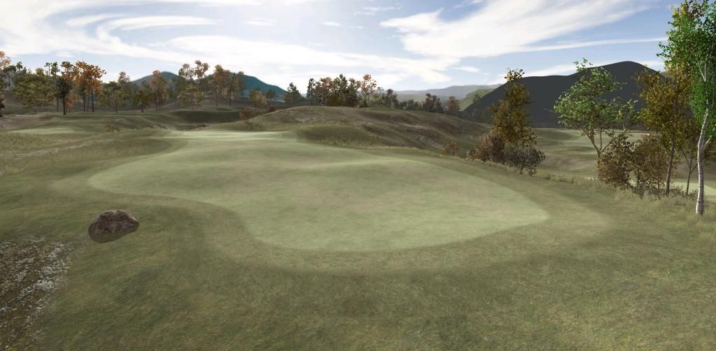
Seriously: What did I do? It's subtle, but take a few seconds and try to find out what's new in this picture...
You won't have to wait long for an answer. And no need to post, because the solution will be published in the very next comment. Still, before you lower your gaze, try to see if you can see what I did? Hint: Texturing.
.
.
.
.
.
.
.
.
.
.... (to be continued)
>>>>>>> Ka-Boom!
• Mulligan Municipal • Willow Heath • Pommeroy • Karen • Five Sisters • Xaxnax Borealis • Aroha • Prison Puttˆ
• The Upchuck • The Shogun • Black Swan (•)
<<<<<
#544

Posted 02 July 2014 - 02:52 PM
So, what I did is this: Schmutz!
The word Schmutz coms from the german language, of course, where it means "dirt". Via the jiddish vernacular it has moved into the english language, and it still means dirt, stain or impurity: "You've got a bit of schmutz on your face..."
What I did was to take a perfectly normal fairway, for example here on the 6th hole at Willow Heath, defined by the red spline, and add child meshes of a slightly different fairway inside of it, the light blue lines
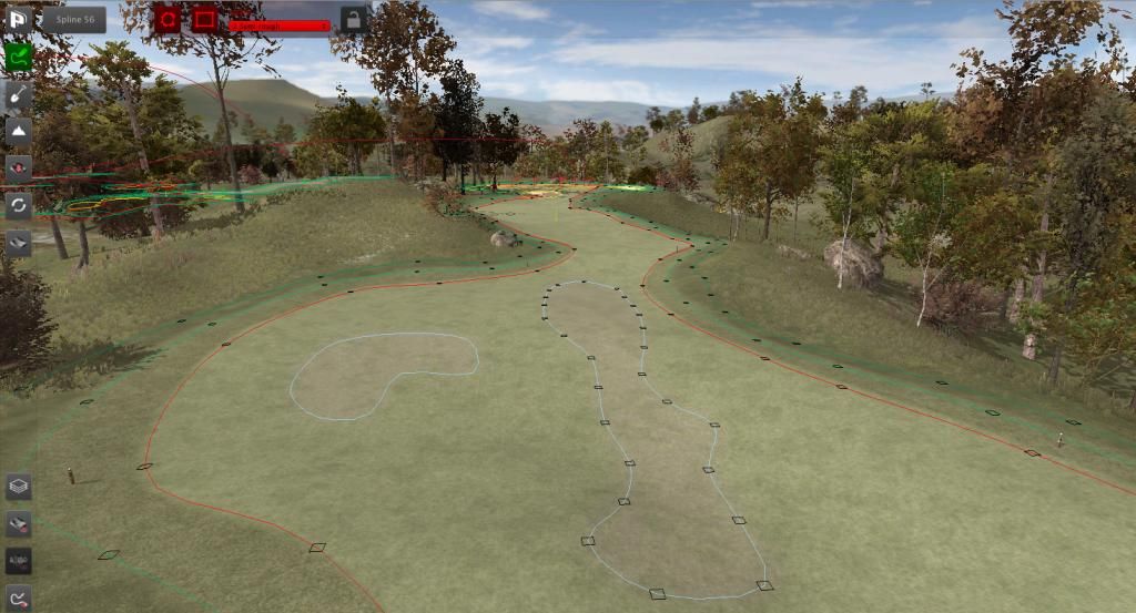
So I basically created a child fairway or a fairway within a fairway. This child fairway is just a wee bit brighter and has a slightly different hue, just enough to be noticed when looking for it and hopefully not enough to notice it.
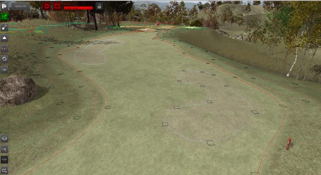
This child fairway also differs in terrain physics. The regular short grass has normal physics, the slightly more yellow patches have hard settings: The ball should bounce further and roll faster when interacting with them.
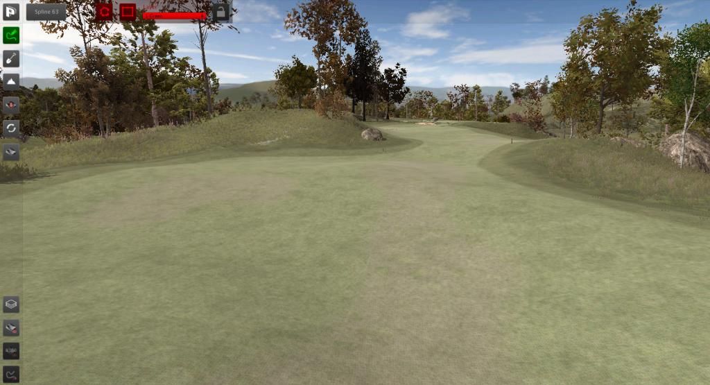
The main purpose is, of course, to add yet more "Schmutz" to the whole affair and to create a bit of visual tension for the onlooker/player. It's a bit like adding an almost unperceptible color gradient to the fairway. Now that you know where to look, you can see the child meshes without the help of the splines.
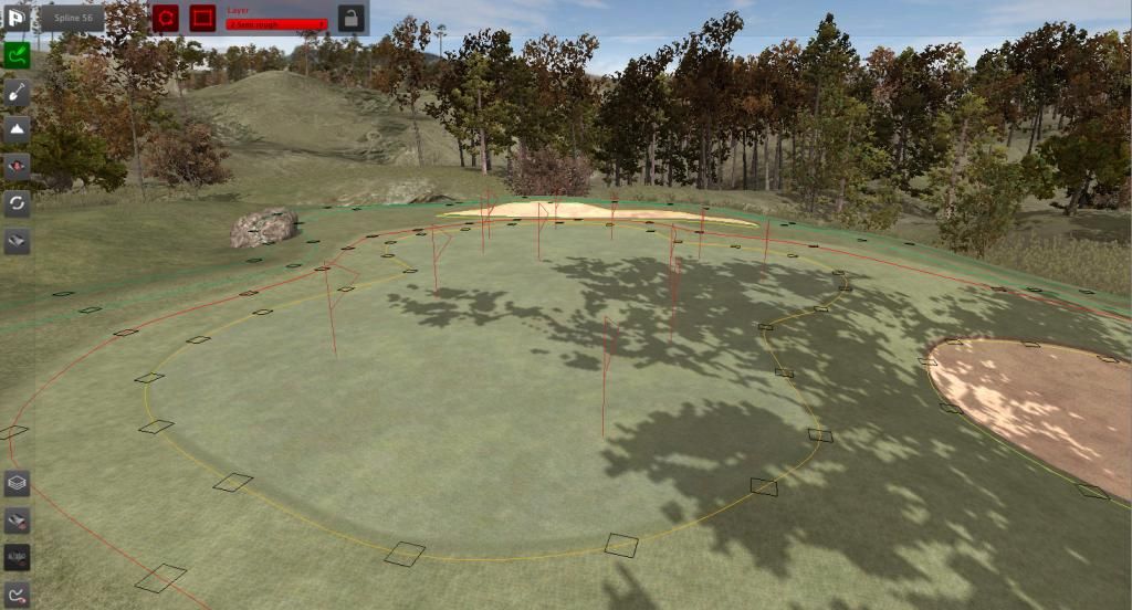
Oh, and of course: Same deal on the greens. Start with the mother mesh, then add some child meshes...
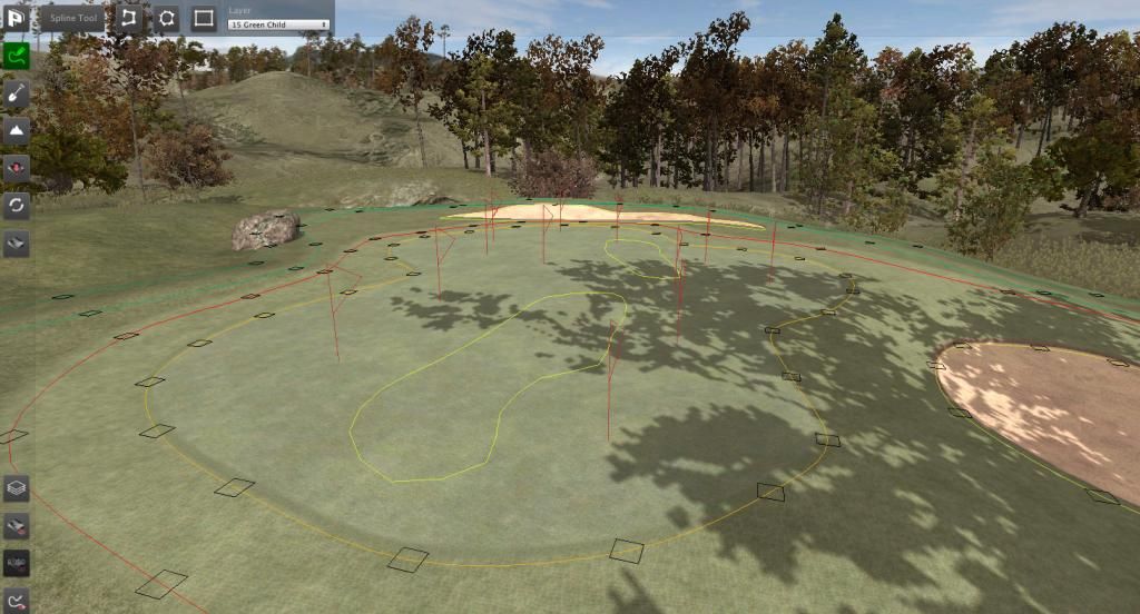
...and put a few patches on the green. Don't overdo it, just a smidgen here and there, and you will get a very Schmutzy green where the putts will roll a bit faster on some and a bit slower on other places.
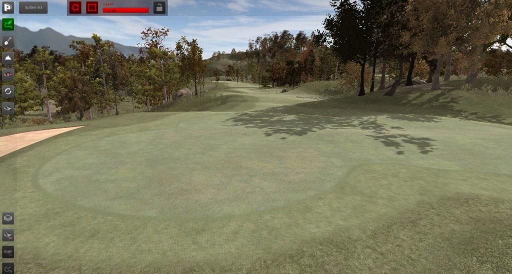
As I said: Use the lightest of touches - just clone the mother texture, save the child textures under a new name and make the tiniest of hue, saturation and lightness adjustments to them. There's a new patch of Schmutz, just a fraction brighter and little bit more yellow right in the lower center of the image - If I hadn't shown you, you probably wouldn't have noticed what I did.
>>>>>>> Ka-Boom!
• Mulligan Municipal • Willow Heath • Pommeroy • Karen • Five Sisters • Xaxnax Borealis • Aroha • Prison Puttˆ
• The Upchuck • The Shogun • Black Swan (•)
<<<<<
#545

Posted 02 July 2014 - 08:03 PM
All well and good.....maybe? But....
...will I be able to read these subtleties on the greens when making a putt?
#546

Posted 02 July 2014 - 09:37 PM
Oh Gott in Himmel! I have to putt on those greens (without grids).
#547

Posted 03 July 2014 - 01:33 AM
Looks excellent K11..anything that adds a layer of realism is a welcome addition.
#548

Posted 03 July 2014 - 05:02 AM
I like the fast bits in the fairway - we'll have to aim for those. Reminds me of aiming for the cart paths in games of past.
Did you try achieving the same effect by cloning the fairway layer and tweaking the Main Color? As the resulting texture is always multiplied by the Main Color there will be no drop in performance compared to having to load in additional textures.
The tricky bit is that you can only darken the R, G and/or B channels, not lighten them, as you can't get brighter than a white Main Color. You would need to start with a slightly altered fairway texture and non-white Main Color to give you room to move. Photoshop is extremely helpful here.
And the disclaimer for those believing CF is too complicated: This is by no means required knowledge to build a fantastic looking course.
#549

Posted 03 July 2014 - 06:01 AM
No shimonko, I do not go near the main color tweaker in the Layers Library - sames as the Unity one for textures, it's simply not predictable enough to work with for me. But perhaps I should... performance economy sounds good. Then again, the physics material being different, it might need to load an extra texture anyway.
I do try to be performance conscious, but my deep scorn for authority and my stubborn streak of compulsive envelope-pushing tend to express themselves in a "Damn the torpedos!"-frame of mind on my end.
Dave, I'm not sure if you will be able to read the greens reliably - I would have to test that. I'm utterly clueless how and if this will play in the game. I don't have a plan or a strategic intent with this, I'm just putting a little bit of Schmutz on the face of my course. You should, at least when watching the follow cam of a shot landing on the green, be able to see where the fast patches are - Everything else will probably have to be guesstimations. Maybe I just introduced something like the "rub of the green" into a computer golf game. Maybe I didn't...
And zero gold stars for everybody for not entering the Glob pop quiz. Lump off!

>>>>>>> Ka-Boom!
• Mulligan Municipal • Willow Heath • Pommeroy • Karen • Five Sisters • Xaxnax Borealis • Aroha • Prison Puttˆ
• The Upchuck • The Shogun • Black Swan (•)
<<<<<
#550

Posted 03 July 2014 - 06:33 AM
Super geil K11!
#551

Posted 03 July 2014 - 06:37 AM
#552

Posted 03 July 2014 - 03:58 PM
K11,
Very, very, nice.
Obviously not all courses require the faded/worn effect to the fairways and greens, but it is really suited to Willow Heath and would also be a god send when creating a course of the seaside links variety and also for anyone trying to recreate Pinehurst #2 in it's restored state, recently seen in both US Open's.
Like has been said, yet another find to add more realism to the designs and the way they play.
![]()
#553

Posted 03 July 2014 - 04:48 PM
Thanks, Daz. But with the addition of these, the number of meshes (objects) defining the golf course has severely increased - I hope somebody who knows can point out to me if this is going to add dramatically to the workload of Unity; some noble savior who will fall into my arm ere I inflict ruination upon myself. Somebody like Mike Jones, come to think of it...
I had my doubts if I had not gone a bit over the top with this and am pleasently suprised by the friendly reception my little experiment received. So, since it's not being hated, here are a few more visuals for you to play "Find the Schmutz".
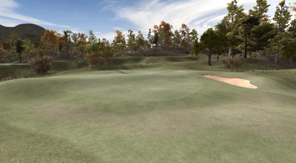
The first is the green of the long uphill 11th, which has been named "Tara's Tantrum" on account of her complaining that it was too long, bumpy and generally unfair with a saddle bisecting the green into two segments. Hm, she's so cute when she's angry and stamps her little feet... The other two are from the 10th, as of yet unnamed.
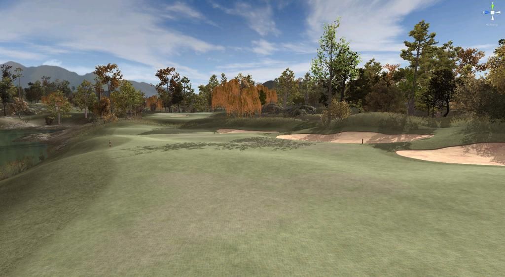
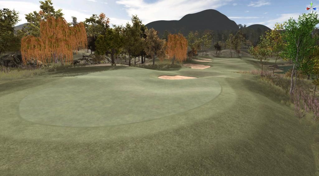
I did try different variations, btw. As soon as the child texture is too light or generally too different compared to the mother texture, the entire view looks ridiculous and fake. The only way for this to work is to really stick as close to mommy as you can. Anything too bold will immediately destroy the illusion.
>>>>>>> Ka-Boom!
• Mulligan Municipal • Willow Heath • Pommeroy • Karen • Five Sisters • Xaxnax Borealis • Aroha • Prison Puttˆ
• The Upchuck • The Shogun • Black Swan (•)
<<<<<
#554

Posted 03 July 2014 - 07:28 PM
I'm in favour of it being classed as rub of the green, adds a bit of realism to it. Just don't add grain!!!!!
#555

Posted 13 July 2014 - 01:22 PM
And so, another Sunday looms - and with it the dreadful task of posting something, anything, tiny little crumbs to keep the starving community nourished for a few microseconds.
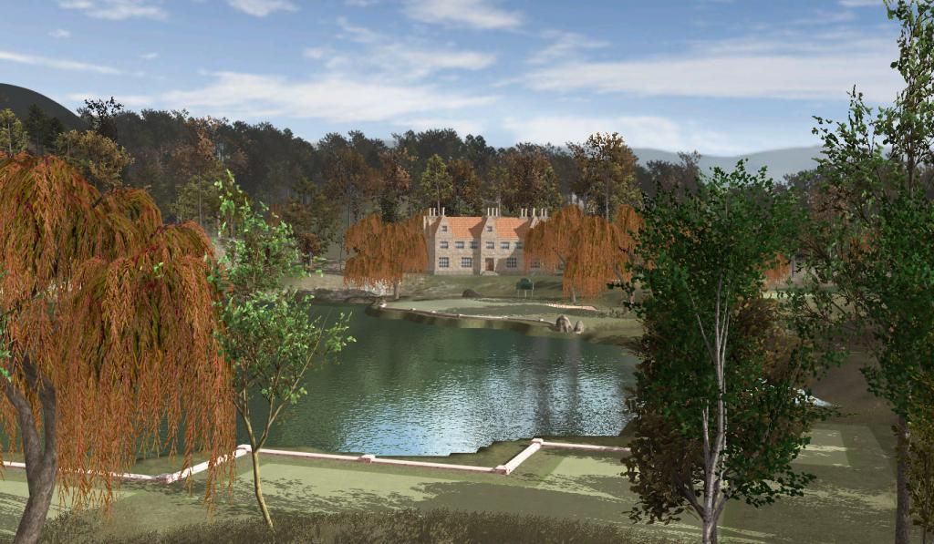
I figured I might as well turn my attention to the clubhouse at Willow Heath again. It never pleased me completely, to be honest. Too small, too mediocre, too derelict. And I decided it had to go the moment I saw AJ playing the last hole on his "PP supports members contriubtions" post/tweet. In that fateful clip, the clubhouse was almost invisible, offered no backdrop, lacked glamour altogether. That would not do! I'm sure others must have thought the same - thanks for saying nothing bad about it, guys. This is the last you'll ever see of it:
So I fired up my 3D modelling thingy, of which I have only a very limited mastery, started by building a few essential modules, went over to Photoshop to construct a texture atlas and copy-pasted the whole bits and pieces into something that went a little bit like this:
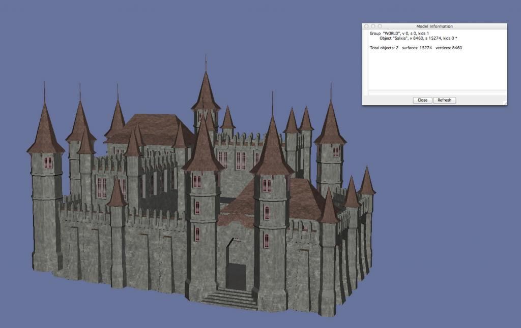
Salixia Palace, Salixborough - the new home base for those playing Willow Heath. It's pretty much low res, btw. It just needs to be visually present, but couldn't pass muster when seen from close. Like a hospital gown, it's open in the back, since only the front is relevant. I did not add much details at all, just threw two types of main buildings, two sizes of turrets and a segment of walls together. And added some stairs. Quite a clumsy bit of work, which I then proceeded to implant into my project.
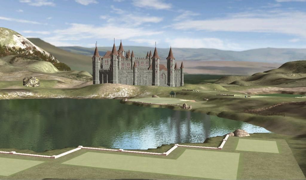
Of course, this transplant required some major landscaping. I wanted the turrets to touch the sky, so I had to lift the whole thing up a bit and put it on top of a motte. And I had to lower the terrain in the back of it, so that the skyline of Salixia would stick out instead of being outstaged by tree tops. Anyway, brief burst of terrain brushes, followed by grass and tree brushes...
I also, as the next pictures show, will have to re-work my panorama, make it darker and a bit lower. Still, basically: Voilà!
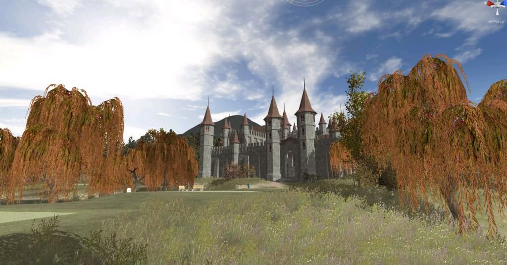
Yeah, it's a bit kitschy - not very subtle or elegant, granted. But look at the bright side: It comes with half a dozen of oubliettes filled with stagnant water and filth. Finally I can seriously do something against slow play on my course!
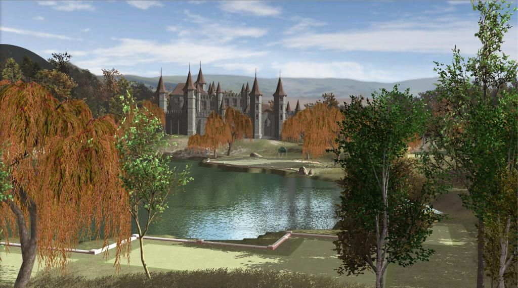
And though it is a bit too grandiose, Salixia does the one job well it is supposed to do: To act as a landmark that is visible from far and to create a backdrop for some of the holes. Like on the 1st hole, if you watch a shot or a replay with the reverse cam, you should get a load of this:
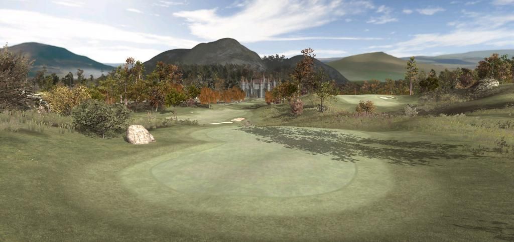
Or this view, while aiming your second shot into the par 5 ninth. Bam: Backdrop! That's what I was after.
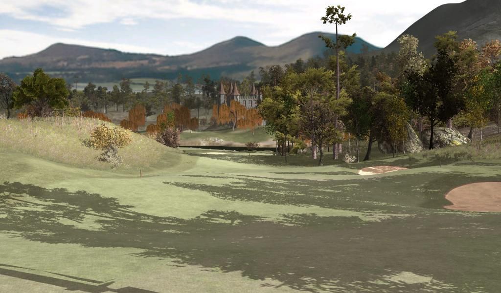
Second shot to the 14th. Woah, what's that in the distance?
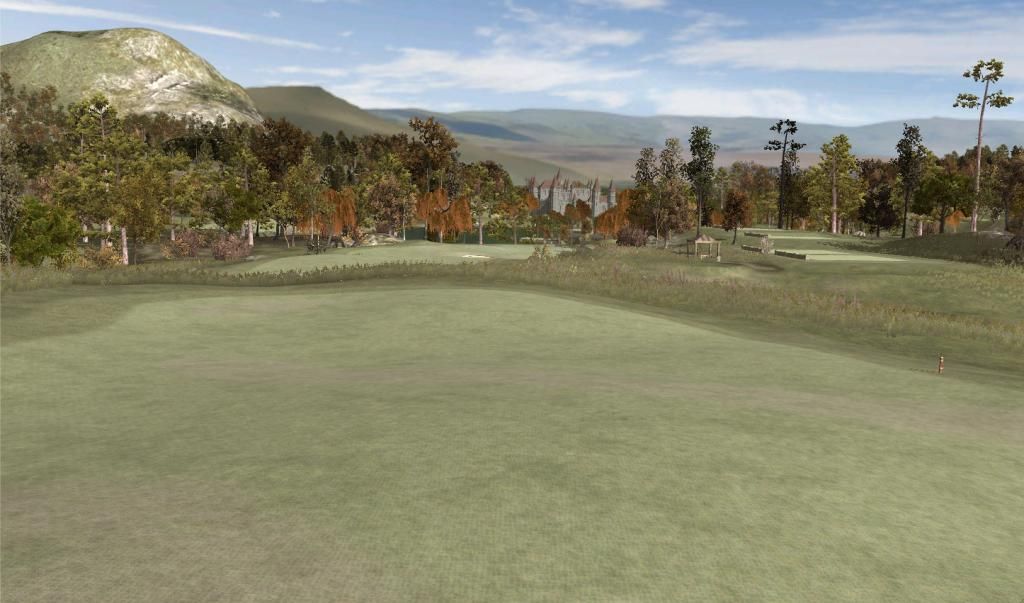
And finally, the home-coming hole, 18th. Salixia as a worhty backdrop. Ka-Boom!
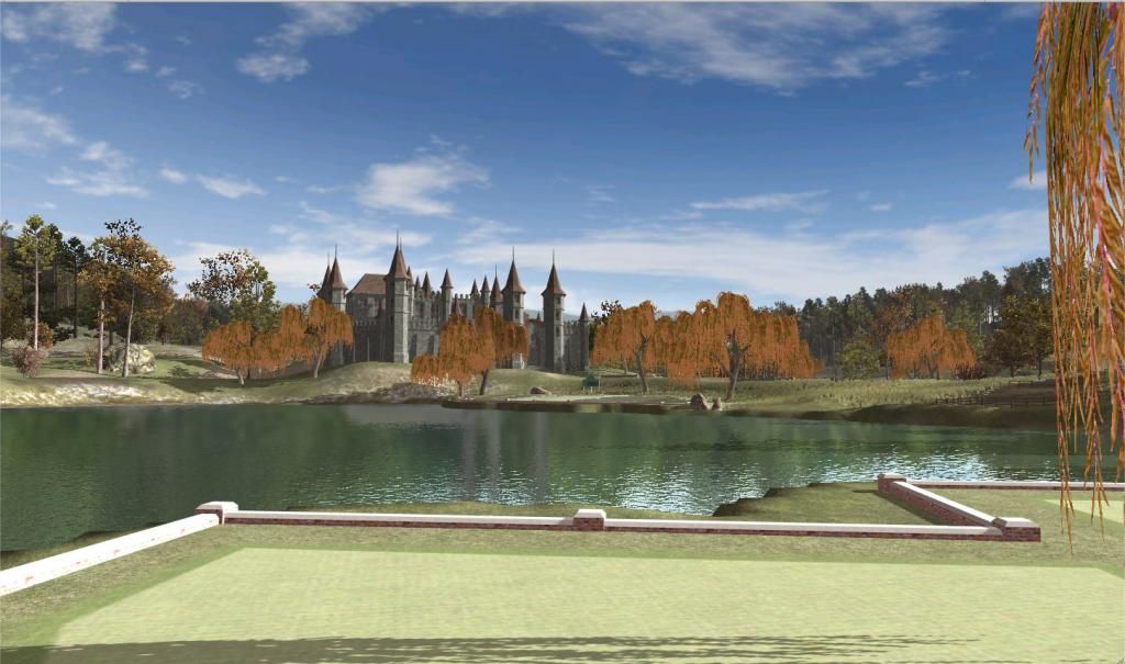
Now if only there were a game to play this mother with...
- highfade and shimonko like this
>>>>>>> Ka-Boom!
• Mulligan Municipal • Willow Heath • Pommeroy • Karen • Five Sisters • Xaxnax Borealis • Aroha • Prison Puttˆ
• The Upchuck • The Shogun • Black Swan (•)
<<<<<
#556

Posted 13 July 2014 - 02:11 PM
I did have a laugh as I scrolled down and first saw the palace! Very nice - fits in nicely.
#557

Posted 13 July 2014 - 02:43 PM
K11, Absolutely beautiful, except of course, for the dying willows. Maybe you should add an arborist or two to you staff to see if they can save the trees and bring them back to a healthy "green" state ![]() .
.

#558

Posted 13 July 2014 - 03:23 PM
That sure is one heck of a clubhouse, lol.
Looks great from all the different viewpoints on the course.
#559

Posted 14 July 2014 - 11:05 AM
As a building it looks great. As a 'sight' on the course it looks really nice. As a clubhouse? Makes the course look like a total fantasy course to me. Would look better off the side of the course rather than as the clubhouse imho. As though the course was in the castle grounds but it was not the actual clubhouse.
Dave.
#560

Posted 14 July 2014 - 12:00 PM
Technically, the clubhouse with pro shop is in the 1st building through the gate (former warehouses and stables). The rest of Salixia Palace are my private chambers and a few office floors of Blammorcorp International Golf Resorts Ltd. There are precedents, Blade. See below... I once even played a round at Dromoland Castle, Ireland, just 15 minutes North of Shannon Airport on the road to Galway. They did not let me into the castle proper, same as I would never let the rabble stray into mine, but it sure felt grand to have it around.

>>>>>>> Ka-Boom!
• Mulligan Municipal • Willow Heath • Pommeroy • Karen • Five Sisters • Xaxnax Borealis • Aroha • Prison Puttˆ
• The Upchuck • The Shogun • Black Swan (•)
<<<<<
0 user(s) are reading this topic
0 members, 0 guests, 0 anonymous users


 This topic is locked


