Thanks you all for your kind words, guys. As I tried to explain in my previous post, I wasn't so much complaining about indifference or fishing for some love, but simply trying to infuse this weary, old thread with a bit of artificial pizzazz, seing as things are usually so subdued around here. So, everything is green, honestly, and I... but wait, what's that?
...but remember K11 has been taking it further than the minimum necessary by doing his own textures (which have their quirks) and other...
Oh? Really? So now we're talking about textures, eh?

I'm as insecure and self-critical as the next man when it comes down to my own textures. I'm not going to ask for a vote on them and I will use what I deem to be appropriate, but deep down I'm not as cocky as I may seem. Textures are something deeply personal, almost private. Diss another man's textures and you're dissing the man himself. So when shimonko points out that my textures have quirks, all I can say is: "Good! I bloody want them to!"
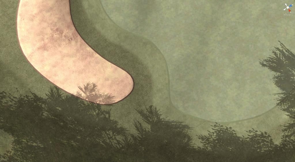
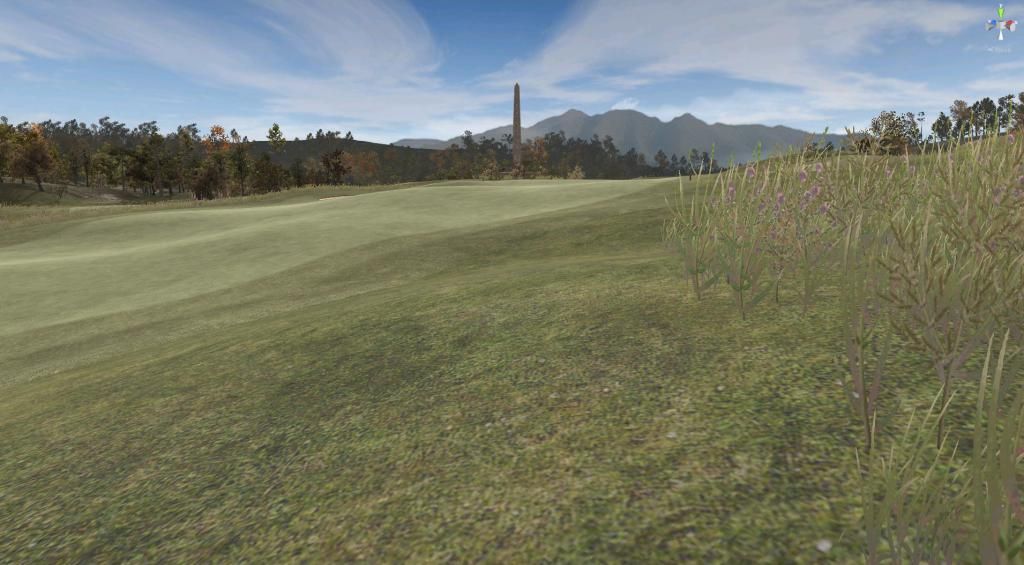
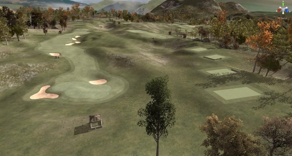
I shall expand on this after you've stared at this little capture of my CF rough texture on the right and semi-ropugh on the left of the image (those who want the full screen detailled view, go via my Photobucket)

We used to make slightly snide remarks on these Forums about the "generic" PP Look in their early works - no matter which course, the golfing parts always looked the same. We now, rightfully so, make jokes about the generic TGC look of idealized gaudy green ribbons looking always the same. Say what you will about my textures, but they do not look like the same.
Textures are crazy-important! I'm not claiming mine are crazy-awesome, but I believe that they are the singlemost important customization measure a virtual course designer has at his disposal. In the game, they will surround the player at all times and quite often cover 50% of everything he sees, and almost 100% of the part of the screen to which his attention, while playing will focus. They are the main medium for the desginer to communicate with the players on his course and to tell him about the character and the feel of the place.
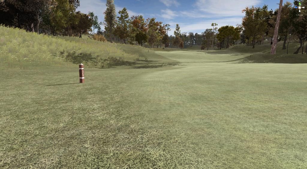
Semi-rough on the left, fairway on the right of image:

Lacking any sort of choice in existing playing surface textures - bar the default textures and shaders provided with the CF (the generic collection) - I had to go and look for new textures myself through the usual channels (Google images, Unity asset store, Turbosquid freeware) and, finding none that suited my taste or that were free to use, ended up making them myself. And getting these textures more or less right took some time and effort.
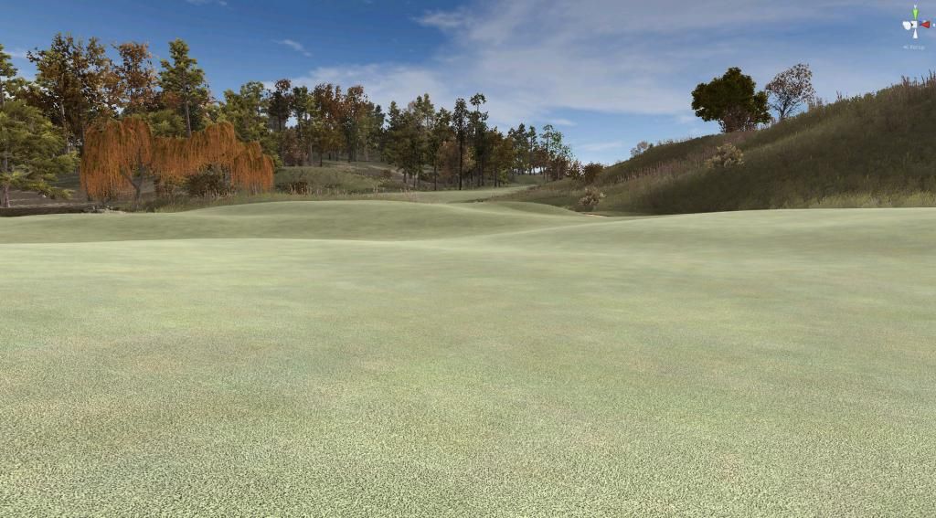
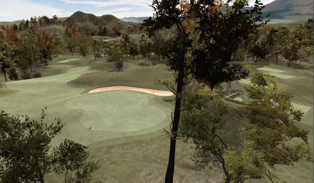
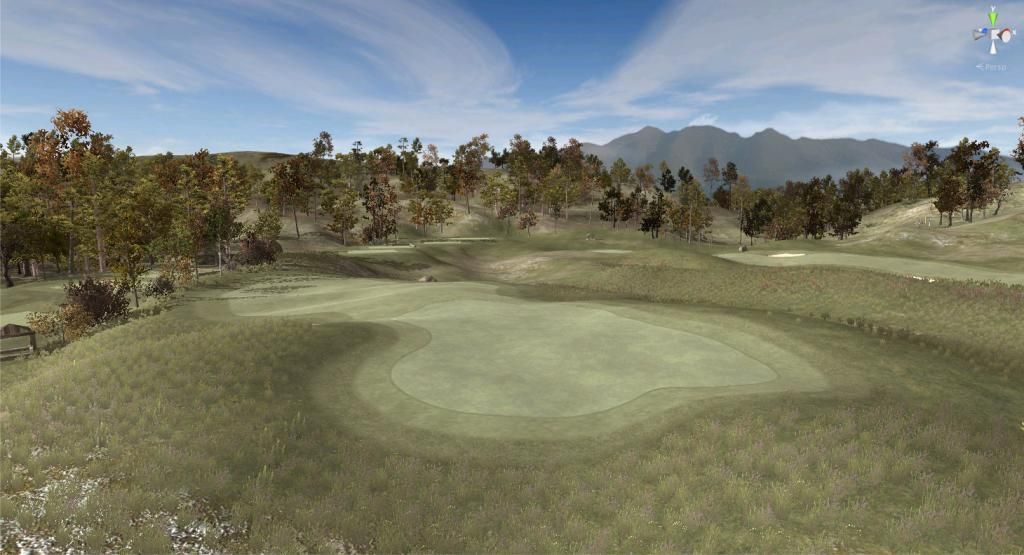
I applied the following two design principles to those I came up with, keeping in mind that my course was a small, local and rural golf course not patronized by masses of golf tourists, but instead a small and modest "hidden gem" kind of layout. But first, this: My green texture in all its quirkily questionable non-splendor.

Principle Nr. 1 - Grunginess!
No perfection allowed! Perfection is inhuman, perfection is an impossible absolute, perfection is a computer age sin! I'm aware of the fact that PerfectParallel sports perfection in their company name and has declared it to be their aim, but in this respect I must part company with them: Perfection is not a worthy goal for me. TGC fairways are perfect. And because of that they look boring, predictable and unrealistic. I want blotches and patches and irregularities and imperfections to riddle my textures. I want them to feel hand-made and different - grungy, noisy, perfectly imperfect.
Principle Nr. 2 - No mow lines!
Ah yes, we've all seen those fancy patterns and mow lines created by advanced machinery. Personal taste: I don't like them. That is also due to the fact that CF doesn't let us control the exact running of mow lines. Note how on some holes you'll see they have a weirdly random, unnatural angle vis-à-vis the layout of a hole. That's because we can't rotate a texture in order to make its geometric patterns fit the required position. For Willow Heath, a poor and rural course, it would be utterly pretentious and wrong to sport fairways and greens with mow lines and patterns you normally would associate with the perfectly manicured PGA courses like Muirfield Village and others. It would be an unforgivable cultural faux-pas to have an UK countryside course texturized thusly.
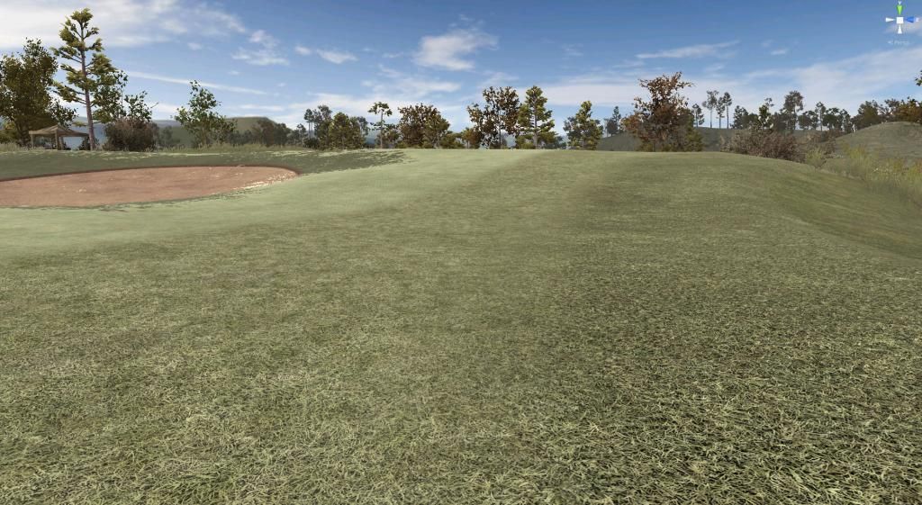
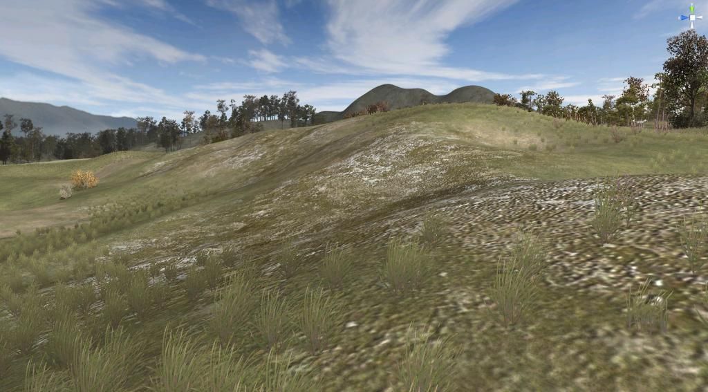
Foreground: Unity rough texture (coarse), designed to transition with CF rough texture.

Creating good textures is a very advanced skill and special brew of alchemy. I won't even pretend that I have even begun to scratch the surface of this dark art. I may know and feel that texture-craft is uniquely vital for golf course design but quite possibly lack the nous and the tastefulness to do something about it.
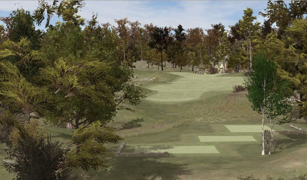
Oh alright, this is getting too deep. Here's another fart joke...

Lovely. Time to wrap this up, without going into details about the terrain textures outside the CF meshes. Quirky is good, that's what I think. Anything that is not bland, homogeneous, perfect, regular, average is fine by me. Considering all of the above, you may feel free to discuss the quality of my textures. But be warned that if you do, I'm going to critique yours in the future if they are not quirky enough.


 This topic is locked


