Jump to content


Photo

Show & Tell


  • This topic is locked This topic is locked
2551 replies to this topic

#441 Kablammo11

Kablammo11

    Obscure Person

  • Members
  • PipPipPip
  • 3,953 posts

Posted 13 May 2014 - 07:10 AM

As far as I know, "Nell" is the IP of Jodie Foster.

And I'm not going to mess with Jodie, oh no, Ian. Not again. Not after what happened the last time... Tara had to come to my rescue, dishing out spinning butterfly kicks and her trademark karate hand chops to ward of Jodie's bloodthirsty pretorian guard of John Hinckley clones. There's a bit of a mutual non-aggression agreement since that event and I'm not going to breach it.


>>>>>>> Ka-Boom!


• Mulligan Municipal • Willow Heath • Pommeroy • Karen • Five Sisters • Xaxnax Borealis • Aroha • Prison Puttˆ

• The Upchuck   The Shogun  • Black Swan (•)


<<<<<


#442 IanD

IanD

    Advanced Member

  • Members
  • PipPipPip
  • 3,371 posts

Posted 15 May 2014 - 06:52 AM

lol... I think I understand now, those long looks I recall are historic moments re-surfacing.. it makes sense now.


Aneeeway.. If I steal away whilst Mr Fresnel purposefully stalks off (I assume I know where he is going, but his sense of direction is misleading as is his knowledge of anything GPS related. His astuteness is without question, but teaching an old dog new tricks...meh!..)


I thought I'd return to a hole whereby I'm tidying up some loose ends and the planting seems to change daily. My 7th hole, par 5, wanders a little and it's a curious question of loving or hating. I have a few holes where blindness occurs.. by which I mean, not seeing where you're driving to. I can think of at least 3 variations of sorts within my course, but as it was plucked out of my memory as a boy, you see things from differing heights back then... such was the size of a proper chocolate wagon wheel, compared to the thumb print it is today.


Within my course, I have a blind green tee shot, a blind fairway tee-shot and this Hole No.7 blind fairway to green approach.  It can of course be played differently allowing the approach to be more thoughtful, but there will be less chance of that elusive sub-par score. So, I'll throw some images to illustrate the look today (remember, everything changes daily, just like the Faraway Tree if you stay too long)..


295wd55.jpg


The Tee Shot - 7th Hole, Par 5


Alot of planting down the right side of this hole is still noisily groaning and growing, but it's mainly aesthetical unless you decide to book a plot. The drive is straightforward.. literally. Veer a little and you may not make it over the small dyke under that bridge. It will need a proper whack to reach the fairway too, as from the back tees, it's 185yds to the fairway. Landing shouldn't be too hard, with an uphill 2nd shot likely.


1z1zf60.jpg


The 7th Hole Laid Out


From the start of the first fairway to the same place on the second fairway, we have a daunting 260yd, with approx 15yds of height difference.


20jh7ja.jpg


The 7th Green looking back


With a distance of approx 250yds to the centre of the green from the edge of the first fairway, you can be faced with a blind approach. The green would also be 10yds below you, which makes things interesting when trying to hit the brakes. The planting behind the green is likely to see several golfers wandering per hour (may need some high-vis jackets for those entering in there!).


Of course, it's possible to hit a good tee shot, bash it up onto the second fairway and see exactly what is what for a 3rd approach shot. Strength is the key here, but like every shot in this beautiful game, controlled strength is far more rewarding. However, in terms of opening the floor... blindness ? Love it or hate it..?


  • Kablammo11, Keith and barryverheul like this

#443 Kablammo11

Kablammo11

    Obscure Person

  • Members
  • PipPipPip
  • 3,953 posts

Posted 15 May 2014 - 01:29 PM

Nice work, your golf spa resort is coming around very nicely, Ian. Do you have a name for it yet?


Blind shots are fine, I'd say. Players will simply select one of the trees on the back to give them something to aim at. If the game gives them enough potential length to have a go, they most certainly will have a go. Nice touch to add this tight, offset green entrance to force them to fly their ball all the way. That ought to be more of a problem for them than the visibility.


>>>>>>> Ka-Boom!


• Mulligan Municipal • Willow Heath • Pommeroy • Karen • Five Sisters • Xaxnax Borealis • Aroha • Prison Puttˆ

• The Upchuck   The Shogun  • Black Swan (•)


<<<<<


#444 axe360

axe360

    Advanced Member

  • Members
  • PipPipPip
  • 6,219 posts
  • LocationSo Cal U.S.A.

Posted 15 May 2014 - 05:37 PM

Small suggestion if I may... Try making the first cut slightly darker then the fairway and not as dark as the rough... Normally the different textures will blend from light to darker...Only a suggestion... I also love the green color of your rough...

You are doing excellent work to date! :)


Done with designing.

Released Courses: Real

The Golf Club @ Dove Mnt. AZ

Aronimink PA

Amana Colonies Iowa

Fictional:

The Grinder Anytown U.S.A.


#445 IanD

IanD

    Advanced Member

  • Members
  • PipPipPip
  • 3,371 posts

Posted 15 May 2014 - 08:17 PM

I do have a name K11...  It's gonna be Aston Country Club.


The blindness of any hole I like... and as you state, you find your landmark or tree to aim for and do your best from there. Hence the fun I had when deciding what to put behind that green. I'm still undecided, and you may not have any line of sight of those trees unless you've gone to the second fairway. I think rewarding the brave is the way forward... those calculating, can take their chances with their caddies selection.


Appreciate the suggestion Axe... may yet fiddle with the textures a little more, certainly.


#446 IanD

IanD

    Advanced Member

  • Members
  • PipPipPip
  • 3,371 posts

Posted 16 May 2014 - 06:21 AM

The 9th from Aston CC - Par 4


So, the drive from the tee won't allow you past the water hazard, but a longer drive positioned further to the left of the fairway can gain a good view of the green and refreshments awaiting you at the halfway stage..


28h0b69.jpg


Planting is still ongoing in several parts of the course, and today we had a large delivery of boulders that I want to have a decent Country Club surrounding wall built. That's for laters though, keeping track of the supply deliveries is hard enough, especially now we have a few guests trying out the rooms in the Complex. Mr Fresnel's comings and goings are hard enough to track, and keeping his room ready is of utmost importance still.


6zlqpf.jpg


What we do have though, is a little mis-communication between the landscapers and the plans I gave them... Whilst a little finishing is still needed around the green bulkhead area, it has come to my attention, they've placed a bunker on the wrong side of the fairway. The original plan was to have the right sided bunker below the bulkhead... and now, we've not had enough sand delivered to allow this without further re-ordering. I'm amused at the explanations...Mr ScribblyNote-Taker, in all his years of experience....(sigh.. even in all those of experience he's made mistakes) has never seen such comings and goings... I'm sure too, I said... with eyes searching downward..


2yv8ped.jpg


So, with an approach already tricky due to the tee shot, should I persevere with the movement of the bunker, or should I leave the approach to the green as it is... the green is difficult enough with a narrow depth, should we penalise those being short, as well as long..?


Answers on a postcard.. stating how many years of experience you have...


  • barryverheul likes this

#447 Dazmaniac

Dazmaniac

    Rock. Loud and Heavy

  • Members
  • PipPipPip
  • 6,941 posts
  • LocationEngland, UK

Posted 16 May 2014 - 05:07 PM

Nice work Ian.


Pic form 7th tee looks mighty fine.


Have to agree about the fairway fringe colour tone, it just doesn't seem quite right. I guess it is the lush green of the rough that is causing the conflict for me. It's as if the fairway/fringe have that sun dried shade of green yet the rough has that lush, well watered shade of green.


Apart from the fairway fringe, the whole layout is looking A+.


#448 Kablammo11

Kablammo11

    Obscure Person

  • Members
  • PipPipPip
  • 3,953 posts

Posted 16 May 2014 - 05:32 PM

Daz, from a "workflow" point of view - and I had similar color scheme issues with my project (and still do) - the final grading of the textures is not a top priority. Changing and fine-tuning the hue and brightness can be done very quickly and very easily and is best left until the very end, once all the trees, plants and other elements have been added. I'm sure Ian will get his colors just right in the end.


I do agree about the A+ rating. Looks like Aston CC will be a fine place; a bit posh and lofty maybe, not something for the lads with a sixpack of beer, but a beautiful parkland venue for the top of the crop. And for Jodie Foster - good riddance, Ian can keep her. I might have to rename Willow Heath into Aardvark Acres to avoid it being sent to the alphabetical bottom of the list .  ;) 


>>>>>>> Ka-Boom!


• Mulligan Municipal • Willow Heath • Pommeroy • Karen • Five Sisters • Xaxnax Borealis • Aroha • Prison Puttˆ

• The Upchuck   The Shogun  • Black Swan (•)


<<<<<


#449 Acrilix

Acrilix

    Advanced Member

  • Members
  • PipPipPip
  • 1,832 posts
  • LocationBedford, UK

Posted 16 May 2014 - 09:35 PM

Why is that bulkhead there at all? No one would spend money building something like that unless it was a necessity.

As to leaving the colours to the end, the problem with that is, the longer you 'live' with the colours, the more you will become acclimatised to them, and the less you will notice how wrong they actually are!  ;)


life ................... don't talk to me about life ................

#450 IanD

IanD

    Advanced Member

  • Members
  • PipPipPip
  • 3,371 posts

Posted 17 May 2014 - 06:32 AM

Very true Acrilix...! I have lived with them for some time certainly.. however, I do know they were an experiment very quickly worked through to ensure I veered away from the default textures. I do intend to go through all of them prior to making this available... it may not look anything like it does..  The recent change in the Beta has also significantly improved the ability to make changes far easier than previously allowed. So, in effect, it maybe wiser and less time consuming leaving those cosmetic tweaks to the end..


As for the bulkhead, exactly...! It was there for the intended purpose of having a bunker below it. So, there it remains until that issue is resolved...


K11 - ;)


#451 Acrilix

Acrilix

    Advanced Member

  • Members
  • PipPipPip
  • 1,832 posts
  • LocationBedford, UK

Posted 17 May 2014 - 07:44 AM

As for the bulkhead, exactly...! It was there for the intended purpose of having a bunker below it. So, there it remains until that issue is resolved...


I'm sorry to sound pedantic, but I still don't see why a bulkhead would need to be built for a bunker in that position.  :huh:

It just looks to me like something placed solely for graphical effect, and comes across to me as a bit 'fantasy', rather than a realistic solution to a terrain issue, as would happen in the real world, that's all.  ;) 


life ................... don't talk to me about life ................

#452 IanD

IanD

    Advanced Member

  • Members
  • PipPipPip
  • 3,371 posts

Posted 17 May 2014 - 08:06 AM

Not at all pedantic.... ask questions and we shall evolve...!


Basically, the creation of bunkers isn't something the CF can do in all shapes and sizes... not yet. It isn't a critique of it as such, just that it isn't currently available. However, the ability to utilise bulkheads in so far as providing a steep face out of a bunker is possible. This is purely something I felt I could add to this course... but as yet, feel unsure is worth the attempt in regards to this hole.


#453 highfade

highfade

    Advanced Member

  • Members
  • PipPipPip
  • 1,749 posts
  • LocationSouth Africa

Posted 17 May 2014 - 09:51 AM

Looking good so far Ian.


I think these first courses we attempt with CF we do all sort of stuff exploring the possibilities what can be done and you are a pioneer dude, well done and KUTGW. ;)  


Intel Core i5-6600 CPU 3.3 GHz       Geforce GTX 1060        16GB  RAM       Windows 10 64 bit

Hazyview  (600m above sea level)    --   Nautilus Bay  (Revamp done)  --  Cape Fear  (TGC  adaptation)  --  Aloe Ridge  --  Nahoon Reef GC  --  Chambers Bay 

Abel's Crossing  --  Solitude Links GC


#454 Kablammo11

Kablammo11

    Obscure Person

  • Members
  • PipPipPip
  • 3,953 posts

Posted 17 May 2014 - 12:21 PM

I think the bulkhead is a remnant of Ians attempt at creating a pot bunker within the constraints of CF, which does not accomodate that feature - one of CF's most glaring shortcomings and one that requires further specialized wizadry to sort out. I'm sure it will get sorted out eventually - Willows Heath needs many of its bunkers to be potty ones and will not be published before this is achieved.


Funny that a bulkhead in front of the green should cause so much anxiety, because hole 16 at WH, called "Benny" was originally designed to have the lower, front half of its green surrounded by a wall. I had thought of that to protect the green of this very short par 4 from ambitious drives, but decided against it when the eleveation rose and the slope became enough of a protection.

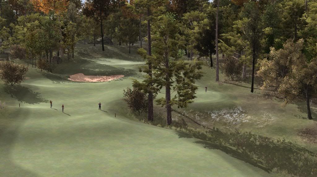
Since this hole is the next on my design patrol roster, let's have a look at it:


16th-fwA_zpsfc126232.jpg


Hole 16, Benny, measures 315 or so yards from back tee to the middle of the green, which is 20 yards uphill. At around 215 yards, what could be a generous fairway is bisected by a group of trees serving no other purpose than to catch and knock down wayward drives. There is room down the left, and a narrow gap to the right of the trees.  You can make out the silhouette of Dick out there, who has succesfully taken on the champion route and now has a slightly easier pitch left. Tom, Harry and Sondra have played it safe.

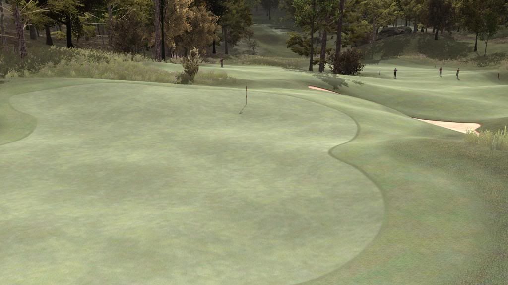
Cut to: the same scene seen from behind the green.


16th-grB_zps93e4917b.jpg


You can make out the teeboxes in the shadows of the glen below. And don't we have to admire that bright sheen bringing out the rolling contours of the green and fairway? That's brought to you by the Fresnel update of the CourseForge.

Benny is a short little hole that should yield many birdies - and break the heart of those that fail to reap them.

Benny is called Benny after Benny Hill. Aaah yes, Louise English, Sue Upton, Corinne Russell, Claire Smalley... I hear you whisper. But no. It's just that the hole is very uphill and members started calling it the Hill - which conjured up nasty mind images of a sweaty Sean Connery panting up a sandy slope. So they started calling The Hill "Benny", which still contained the hill-aspect, but also enable much more pleasant mind image, some of whom I have mentioned above.


  • IanD and shimonko like this

>>>>>>> Ka-Boom!


• Mulligan Municipal • Willow Heath • Pommeroy • Karen • Five Sisters • Xaxnax Borealis • Aroha • Prison Puttˆ

• The Upchuck   The Shogun  • Black Swan (•)


<<<<<


#455 IanD

IanD

    Advanced Member

  • Members
  • PipPipPip
  • 3,371 posts

Posted 18 May 2014 - 06:44 AM

Loving that look K11... you have such an accomplished tranquil scene, that almost gives the appearance the hole is easier than it plays. Good to know Mr Fresnel is with you, and out and about upon your course! He's rang to hold the room here, but with many other things going on in daily life, I've yet to fully check in on him.


As for your original thoughts regarding protecting that green from those ambitious drives, had your bunker been a lot closer, I'd understand that decision. However, you've achieved a great slope to deflect the need. In doing so, I personally feel a pot bunker is so deserving of this hole, I'll hound Mike and the guys to deliver this for us... !


Can't say enough how great this hole looks though... hmm can I can conjure up an image of Sean Connery, with a beret-wearing Benny Hill slapping him on his head...lol..


#456 shimonko

shimonko

    Advanced Member

  • Members
  • PipPipPip
  • 1,718 posts

Posted 18 May 2014 - 07:55 AM

Wow, it's really good K11. The planting is really nice. 


I do think the Fresnel is a touch too high though. It's not so noticeable with the fairway on the first image because of the high camera angle and opposite lighting direction, but I feel the second image it is.
 

Despite the crispness of the shadows and the glare on the fairway, I still get the overriding sensation that it's an overcast day.  Maybe the Fresnel is making me think of dew--but then the lack of color in the light for such a time is not adding up. What you think? It could be the lack of soft shadows in Free Unity which is making me think something just isn't right. It's of course very picky, but I know you care.


#457 IanD

IanD

    Advanced Member

  • Members
  • PipPipPip
  • 3,371 posts

Posted 18 May 2014 - 08:49 AM

I'd disagree Simon.. I think it's just right... I get the feeling the skybox can easily reflect either something of a dewy approach or a long hot dry summer with the silvering of those textures for a late afternoon/ evening feel too.


However, such is the beauty of the CF, it can all easily be adjusted to try the many visualizations I'm sure K11 will try.


#458 shimonko

shimonko

    Advanced Member

  • Members
  • PipPipPip
  • 1,718 posts

Posted 18 May 2014 - 09:35 AM

I guess I'm used to more sun :)


I know it seems petty but Links set the standard pretty high. Although CF alone more than justifies PG, I'd like to think PG will be a big step up from Links.


Seeing Hewi's latest Links flyby the other day reminded me just how good Links courses can look. The 2D imagery, despite other limitations, can just afford better texture anti-aliasing than 3d can (which shows up viewing the screenshots unreduced or as flickering during animation).


#459 olazaboll

olazaboll

    Advanced Member

  • Members
  • PipPipPip
  • 559 posts

Posted 18 May 2014 - 10:56 AM

Ian: The concept of your course reminds me so much of a course I played in Bankok 2 years ago, Its a Greg Norman design ... close to the clubhouse you play among the high department buildings , and in  the outskirts of the course it looks more rural ... even though you know behind the wall you are in the middle of Bangkok ..  The name is Thana City Golf ... if you like to google it up for ideas and insperation ....

Here are 2 of my own pics from the course:

Attached File  Thana1.jpg   61.58KB   2 downloads

Attached File  Thana2.JPG   110.88KB   0 downloads

K11: Your pic of the 16th its the pic from your design that have given me the biggest "kick" ..... so far 


#460 Kablammo11

Kablammo11

    Obscure Person

  • Members
  • PipPipPip
  • 3,953 posts

Posted 18 May 2014 - 11:45 AM

Shimonko, I do have a soft dark fog over these pictures, to add a bit of special depth, hence the gluminess. I do prefer a fine glum to an overbearing gleam, I must confess - About Fresnel intensity, I'm still at my first baby steps with this new tool. Re. old Links courses, they still are some of the best looking ones and TGC does not get anywehre near them, I think. CF/PG might, with the added advantage of 3D.

Be as picky as you want, I'll be as snippy as I can in my replies.

Thanks, Ian and olazaboll.


>>>>>>> Ka-Boom!


• Mulligan Municipal • Willow Heath • Pommeroy • Karen • Five Sisters • Xaxnax Borealis • Aroha • Prison Puttˆ

• The Upchuck   The Shogun  • Black Swan (•)


<<<<<


1 user(s) are reading this topic

0 members, 1 guests, 0 anonymous users