
Show & Tell
#381

Posted 25 April 2014 - 07:50 PM
#382

Posted 26 April 2014 - 02:47 AM
I prefer Ian's girl.
- IanD likes this
#383

Posted 26 April 2014 - 05:46 AM
Been collecting alot of 3D Models again this week and converting them into something useable. Quite pleased with some items gathered, and all freebies. There is a world of 3D out there, and I'd urge those wanting to get creative to learn more and gather things they may wish to use. It's not simply finding the items, it's discovering whether they need further work, whether they actually work at all and what filesizes things are. Not that I can help regarding the last point, the next few months may help understand what the game will allow... anyway, thought I'd drop a couple more images regarding the Course Complex and Car Park...


Added a putting green before the Car Park, so you'd pass that as you drive in. Also, found a reasonable hedge that I can use in various places, as well as some tree planters that seem to look ok, when planted on walkway areas.
What is difficult, is finding the right balance of trees. There are so many out there, with many being purchase items. I've discovered quite a few this week freely available, but many need work on either textures or leaf improvements. As they are literally a necessary item for every course, I think I'll give more time to these and see how they begin to shape. There isn't any way of knowing what will be available with the Course Forge, when released, but most will be used and seen regularly. I think the courses that will stand out, are those that are planted well or grouped well. Of course, those that can afford the trees that are available for purchase may allow more variety, but as mentioned, planting them well can enhance any course. I'll post more as I discover more..
- highfade likes this
#384

Posted 26 April 2014 - 07:24 AM
#385

Posted 26 April 2014 - 07:42 AM
It's a good question Dave, and as yet, I can't give you any straight answer. I hope to tell you at some stage.. it will be a collision certainly. However, I'm unlikely to place it in any area it would be struck by a golf ball... unless you were a crazed golfer trying to play from the green to the tee... hmmm maybe that's a mode we should ask for...lol.
#386

Posted 26 April 2014 - 08:44 AM
From the little knowledge I have in Unity I would suggest clicking the 3D-model in Unity, then choose "component --> physics --> Mesh Collider". There are more types of colliders (I really do not know the difference) but as long as the hedge is a part of the mesh the mesh collider could work - probably ![]()
By the way: I think it would be great to have a special website with all the stuff made and used by the course designers - something like the good old "linkscorner" where to find all custom made courses but also with 3D-stuff like houses, trees etc. which can be used for free. Of course this should be only legal stuff. I think of something like "rfactorcentral.com" for simracing - a place for all rFactor-mods with nearly all the mods published by the community. This would make it a lot easier to find some stuff for creating a course...
Or will Perfect Parallel offer something like this on their own website probably (upload from the community)? This would be the easiest way for sure...
#387

Posted 26 April 2014 - 09:42 AM
I'm sure, with time this will happen, gt5gt. It makes too much sense for us not to have a common database.
The problem about the mesh colliders is that if the game will use them, they will require considerable resources to watch out for them. Best not to add colliders to objects that are very unlikely to be in play.
Ian, your SimCity pictures look absolutely fantastic! The place is starting to look awfully posh, though. There's a free slum huts package in the Unity asset store, named shantytown or so.... If you build a little shanty town on the other side of the course with it, you could add a little social commentary into your project and inflate your polygon count even more.
- Davefevs likes this
>>>>>>> Ka-Boom!
• Mulligan Municipal • Willow Heath • Pommeroy • Karen • Five Sisters • Xaxnax Borealis • Aroha • Prison Puttˆ
• The Upchuck • The Shogun • Black Swan (•)
<<<<<
#388

Posted 26 April 2014 - 09:57 AM
Thanks K11.. I did see that a little while back and played with a small cowboy theme regarding some horses etc.. however, I felt the course would deserve something a little more plush. I do actually have another corner of my current course that houses a church. Being that it is a more 'historic' building, I felt I could utilise that better... ie possibly a graveyard etc.. who knows, maybe a tombstone with my own name on it lol... (why would I do that lol....?).. anyway, the possabilities are endless. That's the beauty of this moment in time..
As for the suggestion of a PP Corner (Links style), it may obviously offend those who prefer a PP Depot.. lol.. I did wonder myself about the element of creating something a short while back. I have every image I ever did for the site back when it was Links Designers Corner... plus some old data for creating a site. However... I've done that, even got the T-Shirt, Mug and a Cap too. It's not for me anymore, time for someone else to do what they think is deserved.
A word of caution on that though, the objects I've gained, are available out there. There are sites already with plenty to be downloaded. They also have names of those attached who created them, so the credits are theirs. It would be a huge task to avoid collecting anything already available and only make those available that are from this community, but not impossible. It's simply something once things do happen here, would need time to surface, as I'm sure we'd all like to play golf too!
It's looking like there is a great future ahead though...
#389

Posted 26 April 2014 - 11:16 AM
I don't know if that's a mushroom or someone trod on the ball on your practice green Ian, but holding down Ctrl-Shift (Cmd-Shift for Mac) when moving objects in Unity will ensure they sit perfectly on any underlying terrain or mesh. You just have to make sure in your 3D program the pivot point of your object is where you wish that object to hit the mesh/terrain in Unity.
#390

Posted 26 April 2014 - 12:07 PM
Appreciate the insight there Shimonko... I'm learning all the time too!
#391

Posted 26 April 2014 - 08:41 PM
Ok... Unsure if this will work, so would appreciate any feedback.
I found 23 Trees... they are far from perfect, but will sit ideally as background foliage. Personally I wouldn't place them anywhere near areas where a golfer will likely mishit, but they may present a good crop of trees that can help those areas where you simply need coverage.
The reasons I say this are because of things I'm yet unsure of regarding trees... I didn't create these, I downloaded them freely from other sites and imported them into Unity. I've tested them all and tweaked a few, but mostly, their shadows don't show the leaves. Some I've tried to describe ie birch, but I'm no expert regarding trees either lol. There may be some that are not worthy, but there may be a few that are... it's your call. I want to at least offer the work and time I've put in, to help others have a little more fun. It's the least I can give back anyway.
Here's an image of the trees.. and as another bonus, there is a guy on bike in there too. Or there should be lol...

DOWNLOAD TREE PACKAGE - 625mb
The file is a Unity Package, and will import all trees into it's own folder named Various Trees, within your Asset folder. You can import all, or those of your choice. It wasn't easy finding somewhere to host this file, so I'd appreciate anyone else hosting this file somewhere else too. My connection is only a maximum 3mb, so this took the afternoon and evening to upload... hopefully it was worth it for some others out there.
- Unique likes this
#392

Posted 27 April 2014 - 08:13 AM
Tanks for this, Ian. I'm dl-ing as I write. I'm good with the 16 trees I have in my project right now, but a tree is a tree: Nothing to shun and something to treasure. Might come in handy in the future.
>>>>>>> Ka-Boom!
• Mulligan Municipal • Willow Heath • Pommeroy • Karen • Five Sisters • Xaxnax Borealis • Aroha • Prison Puttˆ
• The Upchuck • The Shogun • Black Swan (•)
<<<<<
#393

Posted 27 April 2014 - 08:20 AM
Ok.. I think the above post needs it's own thread completely. It isn't a Show & Tell thing and I need to learn more, so having it's own thread will help alot of folk discover the downloads and hopefully more information too. The link is :
Various Trees thread - I have also added a 2nd set of trees for those wanting to download (100mb).
Ok, on with the topic in hand within this thread....!
- Unique likes this
#394

Posted 28 April 2014 - 05:20 PM
So... I started my umpteenth layout patrol the other day. You need to know that I like patrolling around my golf courses, following the flow of the holes, spotting things yet unseen, adding a bit here and taking away a bit there. There's a sacred rule for these kinds of sorties: Something must be changed on every hole! For instance:
I made the fairway to hole 1 a bit wider, more room for error to the right from the tee (or left of picture). And I brought down the tees to the 2nd hole to the level of the 1st green and made it some 30 yards shorter. It now measures about 170 yds.
That helped the 1st green a lot, giving it some more air, so to speak, avoiding the feeling of it being down at the bottom of a crater.
I also got rid of the radio antenna in the background. It felt a bit like I was trying too hard to be special with it.
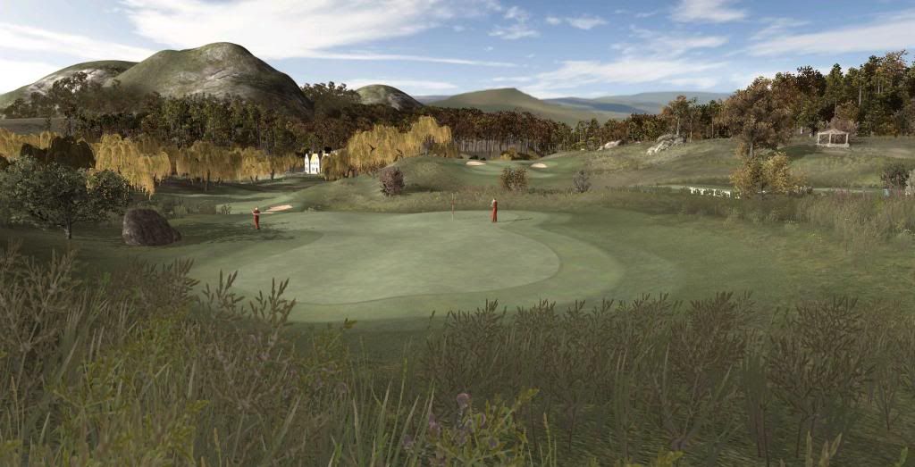
On the 4th fairway and green area I got rid of the little rock-grass-tree island that was insider the fairway some 50 yds short of the green. It made things look a bit claustrophobic. I also added a ravine to the back of the 4th green, running alongside the 5th hole, right of shot, and lowered the hills on the horizon to create more space:
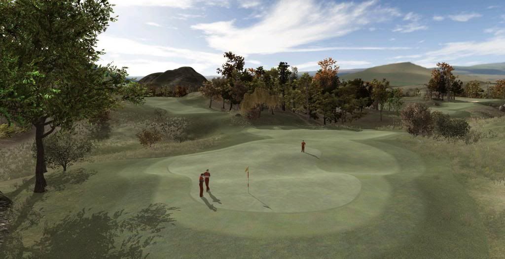
And here we have the new 5th: Where you see the ravine, there used to be an upslope to the left and some trees reaching down to the edge of the fairway. No more. Still a tight little bastard of a hole at around 345yds (in reach from the shorter tees), but again, I humbly believe, an improvement:
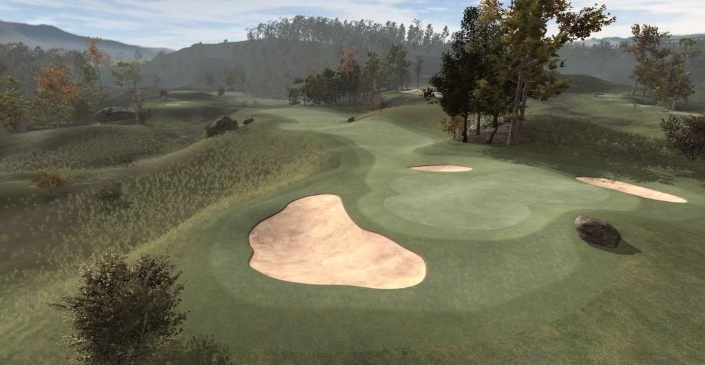
Turns out my little layout patrol had a pattern of sorts to it: Removing surplus foliage, bulldozing away slopes and opening spaces.
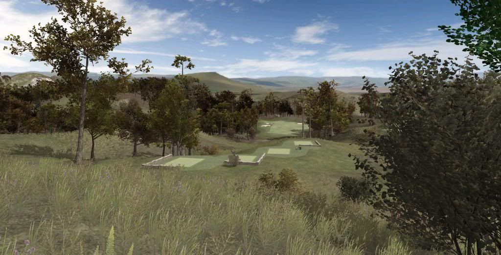
The 7th tee used to be surrounded by trees, asking for a tight tee shot through a narrow gap (Augusta 18th). Now there is more space and less clutter.
I set the light for this last shot to be midday light, btw. I usually go for magic hour stuff, but not in this case:
And that's it. Oh, I hear you ask, friend: "Why, oh why, K11, would you torture yourself over this assembly of emphemeral pixels? Why change and change and change things again, why ponder and patrol, why doubt yourself, why undergo the ordeal of creation again and again?
And again.
Here's why: There's nothing else to do. The Devs are probably all playing TGC. And like you, I'm bored and waiting for... for what? I don't know what, but I'm certainly waiting for it. So I'm killing time this way. I'm slowly beginning to loathe Willow Heath. Can't bare to see that place any more. But I'm locked inside the appartment and all I can do is move the furniture around a bit.
- Davefevs, Keith and gt5gt like this
>>>>>>> Ka-Boom!
• Mulligan Municipal • Willow Heath • Pommeroy • Karen • Five Sisters • Xaxnax Borealis • Aroha • Prison Puttˆ
• The Upchuck • The Shogun • Black Swan (•)
<<<<<
#395

Posted 28 April 2014 - 07:08 PM
After finishing my simple house (see some posts before - just to see if everything works fine with modeling in 3DS Max and importing the model to Unity) I started my first "real house". It is the clubhouse of "The Marshes Golf Club", you can see a real picture of this beautiful clubhouse here:
http://www.pyeandric...shes72-copy.jpg
Being a total noob to 3DS Max and all its details I played around with a lot of options in the last days. For sure I made a lot of mistakes which I hopefully will not do again in other projects, I learned really a lot the last days but there is still sooo much to learn about this amazing peace of software... anyway: these are the first steps, and the model is far away from being perfect. I also tried to create some very, very simple textures (e.g. for the windows) in this project, just to learn how to do this 2D-stuff ![]() . "The Marshes" is not ready in any means, it has a lot of "fictional elements" because of a lot of reasons, but you can have a first look at it if you are interested: (taken from Unity, again in a very simple scene - click on the picture to enlarge it)
. "The Marshes" is not ready in any means, it has a lot of "fictional elements" because of a lot of reasons, but you can have a first look at it if you are interested: (taken from Unity, again in a very simple scene - click on the picture to enlarge it)
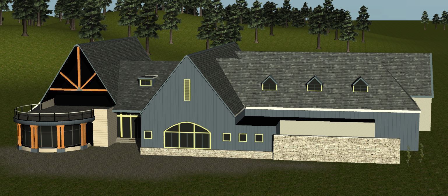
If anyone is interested in the filesize: at the moment the .fbx-export-file has a size of 965 kB - which is quite ok for a building like this I think... so I hope it would not hit the performance massively.
- Jim Boags, Unique, Kablammo11 and 2 others like this
#396

Posted 29 April 2014 - 06:13 AM
This looks very good - and it's also a visually spectacular piece of architecture. If the 1st one was your 1st one and if this is your 2nd, your progress is really astounding.
A few thoughts, feel free to ignore them:
Your roof tile texture is seamless, yes, but the pattern of bright and dark tiles is very repetitive, giving away the single texture squares (considering that a tiled roof is a very repetitive thing in itself, that is not a catastrophe at all). I would, if this were my model, create a texture that reaches from the very top to the very bottom of a roof incline.
And yes: creating your own textures or texture maps aka texture atlasses will become more and more necessary the more your own ambitions grow.
If you haven't looked into bump maps, perhaps this is moment. They would bring out the wood planks, the grain in the beam and the stone wall a lot more, without adding a single polygon. They can be created quite easily as they are a simple alteration of the textures you already are using.
About scaling. Either this is a tiny, tiny house or the two grasses on the right hand side are very strong growers, about six feet high. It's tricky to get the size and the scales right in Unity. Try to import something that you can set the exact scale of and use it as a reference for all other objects.
(I used a grass billboard of Tara King which I set to 1.75 meters height exactly for this kind of stuff)
As for trees, I think you used the ones we see as simple stand-ins, but note how they look like an army of evil arborial clones stomping into battle. But that's another story...
>>>>>>> Ka-Boom!
• Mulligan Municipal • Willow Heath • Pommeroy • Karen • Five Sisters • Xaxnax Borealis • Aroha • Prison Puttˆ
• The Upchuck • The Shogun • Black Swan (•)
<<<<<
#397

Posted 29 April 2014 - 04:37 PM
Course changes look very good K11. Gives things a bit more of a natural look. Less can be more in some cases it appears.
#398

Posted 29 April 2014 - 05:23 PM
Thanks Keith. "Less is More" happens to be my old family motto for several generations, ever since our proud ancestors of the Von Blammo's (The Knallstadt branch, that is, not the Blastenberg one) used it to inspire our many serfs and thralls to stop complaining about starvation.
The patrol continues.
>>>>>>> Ka-Boom!
• Mulligan Municipal • Willow Heath • Pommeroy • Karen • Five Sisters • Xaxnax Borealis • Aroha • Prison Puttˆ
• The Upchuck • The Shogun • Black Swan (•)
<<<<<
#399

Posted 29 April 2014 - 08:17 PM
Yes I would actually agree too.. less does appear to sit well on your course K11... it seems to enhance what is there. I even feel there is a little of that V word mentioned, regarding certain contours on your course too. I'd errr on the side of too much patrolling though... maybe when the caddy arrives officially to allow the choice of clubs, could you then see if that which groweth, should be unsoweth..
#400

Posted 30 April 2014 - 06:21 AM
@K11: Thanks for your suggestions to improve my clubhouse! Because I'm very new to all this stuff first I tried to focus on building the mesh (and I did a lot of mistakes I think but I'm learning from them), it takes time to learn how some tools work in 3DS Max (e.g. the slice plane etc.). I'm still learning a lot about the texturing (still do not know how alpha channels are used to produce a proper glass texture), the bump map and reflection map etc. is something I have to learn too. It all takes a lot of time to get used to. So any suggesions to improve the building is welcome! I also know that it is a very, very simple Unity-scene but it was just to test that the export to Unity works fine. In later versions I wll try to build a nicer scene ![]()
4 user(s) are reading this topic
0 members, 4 guests, 0 anonymous users


 This topic is locked

